Wednesday, April 30, 2014

Double-Sided Printing Instructions! Checklist for the blog and the server are below!

Today in class we learned how to do double-sided printing through the fiery print-server.  I made a lot of snapshots for you so you have references to refer to. Make sure things are set up like they are here.  If you're afraid of running out of money, make sure you buy a new print card from the business office.  I will not accept anything that's not fully printed by the end of class!

STEP 1:  Make sure your book is laid out and complete.  You will want to have a number of pages equal to any multiple of 4.  ( Example: 4, 8, 12, 16.) Everyone's book will probably be around 12 pages.  Remember that we are printing pages in multiples of 4 to compensate for the fact that we are printing 2 pages on each side, front and back, equating to 4 pages for every sheet of paper.

(as an added bonus, you're only charged the price of one sheet of printer paper.)

STEP 2:
Go to FILE ---->  PRINT BOOKLET...


The following window will come up. Make sure the following settings are set.

You will want to keep blank pages selected, so any fill pages you have will print properly.  Notice that in the image below, your pages must be set to fit properly on an 11x17 (Tabloid) Sheet of paper.

To do this, we must click PRINT SETTINGS....

Each of the important windows is shown here.  When you start, notice "GENERAL" Is selected in blue on the right.  You will want to make your settings like the one above. If you selected Print Blank Pages in the last window, it should automatically be selected here. 

STEP 3:
Click SETUP in the menu on the left.  Here you will set your paper size.  You will want to set it to either 11x17 or Tabloid (either one will give the same desired result.)  Keep the scale set to 100%, as shown above, unless you've been otherwise directed by me due to your layout and portfolio design.

Make sure your page position is set to UPPER LEFT.


(this is just an example of the tabloid setting.  Tabloid is just a fancy way of saying 11x17 inches.)


From there, click the "Printer" button at the bottom of the window.  In Step 4, we set up the fiery printer and tell it to print double-sided.

STEP 4:

Below is the first window you see.  Keep these settings set just like this.
The little bar under "from 1 to 1" can be clicked to show the other settings: Paper Handling and Fiery Features are the most important ones.  Under paper handling. Make sure the following is checked, so your pages stack in the proper order. 
 Then under Fiery Features, make sure you select TRAY 2 under Paper Tray.  This makes sure your double-sided page prints right-side-up on both sides.  After you select Tray 2, make sure that you set the Duplex (fancy word for double-sided prints) setting to Right and Left Binding, so your work folds properly.

Scroll down, and make sure the settings below are set in the same window.
There you go!  If you notice, under page setup, it will share the same paper size as you previously set.  Just hit okay and print on every window and you're good to go! Check out the image of your preview above to make sure your work prints the right way.  You may make a few mistakes printing, and that's okay. Just bring enough money to print properly.


REMEMBER I NEED 2 COPIES OF YOUR PORTFOLIO! MAKE TWO! AND BE READY TO TURN THEM IN BEFORE THE END OF CLASS! NO EXCEPTIONS!

============================================

PROJECT CHECKLIST
I will want you to turn in the following images to the server in class on Thursday.
These must be uploaded by 1:00 on Friday.

============================================
Have your blog and the server on the folder updated with EVERY PROJECT FROM THIS SEMESTER!


Projects: (7 through 12 are new items)
  1. Your Self Portrait (p1)
  2. Your artist research for the Gestalt Principles project. 
  3. Version 1 of the Gestalt Principles Project (p2a)
  4. Version 2 of the Gestalt Principles Project (p2b)
  5. The 2-D layout design of your Papercraft Project, with instructions on building your papercraft. (p3a)
  6. Photos of the 3D finished product of your Papercraft Project (p3b)
  7. Version 1 of your movie poster (p4a)
  8. Version 2 of your movie poster (p4b)
  9. Your infographics project (p5)
  10. Your final photoshop project (p6)
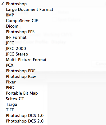
  11. Your portfolio! We will export these out as a pdf in class on thursday. (p7)
  12. if you have it, your typography test, and any extra digital work you want to showcase, (p8)
  13. Any written notes from artist lectures this semester.

Documentation for the blog includes the following:

  • An ARTIST STATEMENT about your work.
    • What is your process when creating your assignment?  What was your idea?
    • What tools did you use to create it?
    • What color scheme did you use when creating your project?
    • How do you feel about the finished result? Would you change anything or make improvements if you were to recreate your work of art?
  • PHOTOS of your created works.
    • For extra points:  Showcase your artwork at different stages! It helps better communicate your personal artistic process.  Add sketches, notes of your work, and add any links to artists that inspired you.

In addition to these things, I will want you to turn in the following images to the server in class. In the FD170D folder, you will do the following:
  • Create a folder with your name. If you already have one, great! If not, make one.
  • I need a .PNG image of each project with the following naming convention:
    • "lastname_firstname_pX" (where X is the project number of your assignment.  Refer to the top for the project names in parentheses.)
  • I need a folder with snapshots of your photos for you assignment.


Thursday, April 24, 2014

Homework, Notes and Resources for learning Indesign:

HOMEWORK:

1) Lay out your pages in Indesign!  You must have your images, text, and page elements placed in! We are covering the basics of using indesign in this project. 
2) Have your Photoshop Project 90% Complete! This means that all of the pieces for your project must be created and in photoshop!  You will have time to refine your project and print in class!
2A) For those of you that want to print on the large 4400 printer, come to class with the paper you want to use to print!

------------------------

EXTRA NOTES:


Below is an outline for Indesign. This serves as a reminder for what we learned in class today.

A. Make a new document in Adobe Indesign. (ID)
  • Set your Size to Letter (8.5 x 11), and your orientation to portrait.
  • Set your page number and margins as necessary.
    • Remember the minimum margin for printing is 1/4 inch, or 1.5 picas.
  • When Indesign is open, you can always create new pages to add!

B. Lay out all of your pages in Indesign.  Make it as close as you can to your final iteration. 
To do so, you will:
  • Open up illustrator.  
  • Copy your grid, and image files from illustrator (Command C)
  • Paste your image files into your Indesign document. (Command V, in Indesign)
  • Remember you can make multiple MASTER PAGES for your projects!
  • TO EDIT PHOTOS:
    • The SELECTION TOOL will edit the frame of the photo.
    • The DIRECT SELECTION TOOL will edit the photo itself.
    • REMEMBER TO CLICK THE "INSIDE CIRCLE" OF THE PHOTO to edit the image itself.
  • TO SCALE PHOTOS:
    • Click the photo once, hold OPTION and SHIFT, and scale the image at the CORNERS.
    • Option 2:  Right Click the image, and select TRANSFORM -----> SCALE.
  • Remember to bring in your TEXT and PHOTOS on a DIFFERENT LAYER than your GRID!
  • You can PREVIEW the final design by hitting (SHIFT + W)

C. After that you will need to lay out text:
  1. Select the text tool from the tool bar.  
  2. Drag out a text box like the ones we make in illustrator.
  3. Remember that you can modify the outside edges of the text box, and manipulate specific anchor points in Indesign with the DIRECT SELECTION TOOL.

We will work on these in class, but you must have all of your images laid out in an Indesign file.  Feel free to play with the designs and layouts.  Remember that you are mostly copying your layouts made in illustrator, bringing them into indesign.

---------------------------------------------------
LINKS AND RESOURCES:


Here are some links that offer examples and tutorials for indesign. Feel free to thumb through them if you are having trouble remembering what we covered in class. I recommend the video first

Indesign basics:  (These may help the most.)
http://wiki.digital-foundations.net/index.php?title=Chapter_13_CS4
http://wiki.digital-foundations.net/index.php?title=Chapter_14_CS6

A PDF Introduction to Indesign (34pages):
 http://www.docs.is.ed.ac.uk/skills/documents/3648/3648.pdf

Video: 10 things beginners want to know about indesign CS6:
http://tv.adobe.com/watch/creative-suite-podcast-designers/how-to-get-started-with-adobe-indesign-cs6-10-things-beginners-want-to-know-how-to-do/

This is our first day covering Indesign. Do your best when laying out your images, and remember that the majority of your work will be copying and pasting your images, should you have finalized a design you are happy with. Having all of your work laid out over the weekend will make it easier for you to print next week!  Remember that spelling does not have to be finalized, and you can still be moving page elements around, but I want you to have your elements for your book already laid out!

As always, EMAIL ME IF YOU HAVE ANY QUESTIONS! =D

Tuesday, April 22, 2014

Homework for Thursday, and Review about Layout Design

For Wednesday, begin to create layouts for your portfolio!  Remember that I need at least one design for your front and back covers.  To help you with making your designs, I have an example I made that covers the entire process.  This gets in-depth with some elements that we covered earlier in the semester. If you need a refresher or feel like you're stuck in making your designs, read the post below in its entirety.


As a reminder, remember the difference between legible, properly laid-out type, and arbitrary typographic layout that needs improvement.  You are free to create any layout you wish and create any grid you want.

I will be looking for the following on your portfolio pages:
  • Arrangement of text and image.
    • Your image
    • Image Title
    • Your name
    • A concise artist statement about your work.
  • Hierarchy of information presented.
  • Grid layout and spacing.
  • Are you able to explain how your type is laid out?
  • PROPER SPELLING!
Below is a recap of what we covered in class:
---------------------------------------------------------------------

Today in class we covered typographic layout in an introductory fashion! We used a number of tools to create the work above. To begin, we created a new illustrator document. (Letter: 8.5 x 11)

STEP 1
Using the Rectangular Grid tool (Found by clicking and holding the linetool box), we created a grid on the desktop.  To create our grid, we clicked on our workspace.


The following image should pop up:

You will want to adjust the default size to the size of your image, and edit the number of horizontal and vertical grid lines (horizontal and vertical dividers). For the example below, I selected 4 for each.  This creates a grid made of four lines.  This way, we're forced to work without a line of symmetry, and create asymmetrical balance.

After hitting okay, you will want to move the grid into place.  You can also click and drag out a grid, but the method previously mentioned lets us create specific dividers and settings.

STEP 2

I used some dummy text for my example, to worry less about what the images are about. The text used was LOREM IPSUM... click the link below in case you need a refresher

Website for Lorem Ipsum dummy text:  http://www.lipsum.com

For the example below, I also made a couple guides to give the image half inch margins all the way around.  This helps keep our text on the page.  I said you can use quarter inch margins for your portfolios, but that is the bare-minimum.  From there, we aligned our type along the grid.  As a reminder, remember that one character gives you a myriad of ways to arrange type.


Following that, I opened the character tab by clicking
WINDOWS --->  TYPE ----->  CHARACTER in the top menu, to open this window.  There are tons of settings for alignment, tracking, and leading for your characters; adjust the parameters of each as needed to lay out your text!


Below:  The title has been created with 80pt font, the subheading under the font was aligned along the title's descender line (16pt font).  The paragraph below was created by drawing a text box with the type tool, and setting the type to 11 pt font.  We lined up the sub heading and paragraph along the same line as the "m" in "Lorem."  This creates an invisible line of action that makes all of the content on the page much easier to read once the text is gone.  To add an extra level of clarity, the title and paragraph both rest their baselines on the grid we created. It is a subtle detail, but with more text on screen it means all the difference between legible type and an incoherent mess.


If you don't see all of these options, know that you can see them by clicking "Show Options" in the menu tab.


You can arrange...
  • along the grid
  • along the characters themselves
  • along the base line, ascenders, or descenders of your characters
  • along the apex of the x-height
  • in relation to the edges of your image's frame
  • and many more!  Use the image below for a refresher for the parts of type.


The trick is to create ASYMMETRICAL BALANCE, using everything you've learned so far about visual hierarchy and the various principles of art to create a layout that is interesting to see, but also clear to read as well.  Those of us who are truly great at art making need to also be great at laying out type on a page.  They go hand in hand, especially in doing the most important thing we do in art -- showcasing our work to others.

STEP 3: Arranging type and manipulating leading, kerning, and tracking.

If you look at the character tools above, you also have options for kerning, tracking, and leading.

To review:

  1. Kerning:  The amount of space between each individual character.
  2. Leading: The amount of space between a single line.... such as the space between the kerning definition here, and the leading definition.
  3. Tracking:  The amount of spacing each letter has in the entire paragraph.  Good for making large uniform adjustments.


A couple introductory rules of thumb:
Small text needs wider leading or tracking to be well read, and large text can sometimes benifit from less tracking.
With larger text, it is a good idea to manually modify the kerning between each letter by HOLDING OPTION + ARROW KEYS LEFT OR RIGHT

Here is a link that offers a more indepth example of the three, with images:  http://www.designtheplanet.com/typography-101-kerning-and-leading/

STEP 4: Making multiple designs  (Will cover artboard tool on THURSDAY):

If you need to, you can use the ARTBOARD TOOL (SHIFT+O) below to create new artboards on the fly. This may help with making multiple layout designs for the same image.

  1. Click the artboard tool.
  2. Make sure all of your layers are unlocked.  
  3. Locked layers will not duplicate the work in them to the new artboard.
  4. Hold option and shift.  Click the artboard you're currently working on and hold.
  5. Drag out as many artboards as you need, and manipulate your type and images as needed.


You can also do all of these things in landscape!


Below you can see one image I made, as well as what my desktop looked like.  There are a bazillion and one ways to lay out text and image. Use the skills you have gained with arrangement and layout to make a portfolio you can be proud of!


Thursday, April 17, 2014

Homework for Tuesday!

1. Have your new project 33% complete. What that means is:

  • Your idea finalized.
  • Blog posts about your development process.
  • Your work started in photoshop, with some development and execution of ideas.  The more you have complete, the better.
  • Schedules for shooting if you are doing photography.
  • Drafts and designs roughed in for illustration and painting.
  • Sketches for those using Photoshop to design sculptures.


2.  Create layout designs for your portfolio. I need:

  • Designs for your front cover.
  • Designs for your left pages.
  • Designs for your right pages.


2A.  To help you design, You will need the following to best showcase your artwork on each page:

  • Your work of art
  • A concise description about the work of art (artist statement).
  • A title.
  • The medium. 
  • A page number in the corner.
I know we covered a lot today, and you will have questions going forward.  Email me if you have any questions about the tools we covered, or the project itself!

Final Photoshop Project: Dealer's Choice of Champions! *cue dramatic music*

For our next project, you will create a work of art of your choice!  We have a few more tools to cover to round out your skill set in Photoshop.  However, you should know enough by now to be able to make quality work if asked!  

Therefore, in your final Photoshop project, you will be asked to do the following:

Use your research from spring break to guide your motivations! Focus on the kind of work you're interested in making as an artist! Try to make something new, and push yourself as an artist beyond your limits! The final medium will qualify as "Mixed Media," but you are free to make the majority of your project 

A. Tools to Use in Next project:

  • A layer mask. (use a photo on the server as reference)
  • Marquee tools:  For selection
  • Clone Stamp Tool:
  • Burn and Dodge:
  • Adjustment Layers (For color Correcting)
  • One scanned in element:  Hand Drawn Element, A fabric to use as texture, Etc.
  • One element created purely in photoshop.  (We will cover some introductory digital painting today to help those of you that want to do a more illustrated piece.)


All composition elements must be cohesive, meaning that they should feel unified enough that we begin to have difficulty distinguishing the software used to produce the image!


B. Blog Upkeep for Project:

Your blog will be used in a more professional manner for this project.  I'll expect you to showcase the development of your artistic process while you're working.  Keep snapshots of your work!  Scan sketches! Highlight artists that inspire you! This is a documenting tactic used by artists to boost the professionalism and outreach of their blogs.  By showcasing your artistic process, you demonstrate your ability to conceptualize and execute future projects in an insightful manner!


C. Grading:

I WILL GRADE YOUR PROJECT BASED ON THE FOLLOWING:
  • COMPOSITION
  • USAGE OF REQUIRED TOOLS and ARTISTIC ELEMENTS.
  • BLOG UPKEEP
  • SYNCHRONIZATION OF DIGITAL and ANALOG ELEMENTS for YOUR PROJECT.
  • CLARITY OF MESSAGE
  • CRAFTSMANSHIP
  • CHECKPOINTS HIT ON THE WAY TO COMPLETION.


We will print this project using the Large-Format Printer, closer to the end of the semester. We will work on this, and your final project, your Portfolios, in tandem.  The next challenge for you as an artist is balancing multiple projects at once.  This is something you will need to efficiently accomplish as you continue your education here, and ultimately graduate.


D: Due Dates to Hit:
  • Tuesday April 22nd:   Project must be 30% complete.  Design must be locked down, and idea must have some progress.  We will start indesign this day as well, so it is a good idea to stay proactive!
  • Thursday April 24th: Project must be 50% complete.
  • April 29th:  Project must be 100% Complete


During this time, we will work on constructing our portfolios in class.  I will show you what to do to begin arranging your portfolios Monday.  
  • Note: It is a better idea to complete this project sooner as opposed to later.  Giving you a chance to create something on your own does not mean doing the bare minimum before today and next thursday. Turning in something of low quality is only hurting you.

Thursday, April 3, 2014

Homework for Tuesday!

Produce Version 1 of your infographic!  It does not need to be printed, but by the beginning of class, I would like to see your infographic up on your screen, ready for feedback.

We will spend part of class splitting into groups to discuss these, and then we will spend the rest of class working to make improvements.  Come to class with any questions you have about producing your art, and as always, email me if you have any questions!

Tuesday, April 1, 2014

Assignment For Thursday!


  1. Have your chart printed and on my desk by 4:20, and not a second later!
  2. Sketch ideas for what you would want your infographic to look like. Have at least one sketched out design ready to present to me.  Remember the theme is "How I Spend My Time."  Use your artist research and the chart you made to sketch out ideas.  Think:  How would you best like to showcase your information?  What is the best way to show others how your time is spent?
  3. For those of you who have more questions about how infographics are used, and what we will need, you can check this handy example given to me by Yvonne as part of her research.  http://neomam.com/interactive/13reasons/
  4. We will start class thursday with a demonstration.  I will show you how to achieve some of the effects used in your research.  This will help you in designing your infographic, and coming up with other ideas.

Thursday, March 27, 2014

Assignment for Tuesday!

A. Experiment:  Use what we learned about typography in class to create a image that covers the ABC's of typography:  ARRANGEMENT(placement), BALANCE, AND COMMUNICATION.

Think of it as this: You are making a message to go on a T-shirt. What would that message be? How would you show it?

This is just like the experiment we did in the last half of class today.  With only words, and the placement of those words, use what you know about type to create a message that communicates an idea.  The image i created in question simply used the words "Tacos are Awesome."  This is a chance for you to experiment with typographic design. You have http://www.lipsum.com if you need placeholder text, but the final image must have text that creates a clear message.   You may use any colors you choose.

B.  Begin research for your Infographics project!  Below is information that recaps what I covered in class today, plus a little extra for what you need on Tuesday.

Infographics are defined as:

in·fo·graph·ic
ˌinfōˈgrafik/
noun
plural noun: infographics
  1. 1.
    a visual image such as a chart or diagram used to represent information or data.

    "a good infographic is worth a thousand words"
-----------------------

Their use has risen in prominence over the years, and now you are able to find info graphics just about anywhere on the internet! As a point of reference here are some websites with tons of info graphics for examples! You can find more with a quick google search.


--------------------------------------
For homework:

Part 1:  Research
A.  Find 5 info graphics that are indicative of the level of polish and quality you want to achieve in your work. Look for these things when selecting your image:
  • Clarity of the message and information presented.
  • Cleanliness and Craftsmanship.
  • Visual hierarchy of information.
  • Overall alignment and spacing of elements of the image.

B.  After you select each image, save a copy and post them to your blog. Write on your blog why you selected each image.  What about the information presented appeals to you?  What were you first attracted to when viewing the graphic-- the way the information was presented, or the information itself?

Part 2: Documentation and information gathering.

A.  Create a table that documents your life on a weekly basis.  It will help to divide the time each day into thirty-minute chunks.  I created an example below of how we will catalogue this information in class on Tuesday.


As always, email me if you have any questions! If we did not critique your project today, we will critique it on Tuesday

Thursday, March 20, 2014

Project 4: Movie Posters!

Movie posters, in the history of cinema, must find ways to create a compelling story that makes the viewer think "I want to see more of this."  It's an evolution of what we've done in art galleries for hundreds, if not thousand of years - interact with a work of art, and imagine what happens beyond the surface.

While we have a solid understanding in creating compelling images, we have yet to break down the way artists integrate type into artwork seamlessly.  If you do not know anything about type, it is easy to write off text as simply "placing it on paper, and moving along."  There is a lot more to it than that.

After watching Helvetica, you are tasked with creating a movie poster using your new knowledge of typography and photos of your paper craft characters!  This is a short project that gives us the chance to use text and image in ways we never thought possible!

Over the weekend, you will have a chance to do that!  You will need to do the following:

A. Create a new file in Photoshop:  
Orientation: Portrait 
Dimensions: 11 inches (width) x 17 inches (height).  
Resolution: 300 DPI.

1.  Create a design for your movie poster! Use a combination of photography, color correction, and moving objects around in Photoshop to create an image that evokes the feeling for your character's movie! This design is created by either using your best images from midterm week, or creating new ones based on the idea you are using. Make a composition with those images in photoshop, and arrange them in a way that you are happy with!

2.  Save that image out as a PSD or a PNG, and open it in Illustrator.  Using the few things you learned about typography today, lay out the text for your movie poster in a way that unifies the two elements (text and image) together! This is your first project that teaches you how to work with Photoshop and Illustrator in tandem.

3.  This image will be your first draft.  On Tuesday, have this image printed via the fiery printer and pinned to the wall by no later than 4:45.  As stated in class, you will lose a letter grade for every 2 minutes your work is not up on the wall. This is a way to boost our professionalism and timeliness!

Extra notes:
You can integrate outside elements into your images. Hand-drawn elements, photos, and the like can be used. Using the pen tool and selection tools, you can use imagery you have created from other places to accentuate your image!

If you need additional photos, I will bring the photography materials for Tuesday. 

For grading, I will evaluate the following:

Craftsmanship
Design: Use and Layout of Type.  Are you aligning the type, while giving enough room for your characters?
Clarity of Message: Does your text and image work together to tell an enticing story for your character?
Use of both Photoshop and Illustrator in tandem.  Does the integration of both into your art look seamless?


After bringing these first draft to class on tuesday, and you will have the entire class to work.  The final draft, (Version 2) will be due on Thursday at the beginning of class.  Thursday will be a critique day, where we critique our movie posters, and our paper craft characters. HAVE V2 PRINTED AT THE BEGINNING OF CLASS ON THURSDAY!

Introduction to Typography! =D

RESOURCES and READING MATERIALS:


Check out this link for an introduction to type and type terminology: http://graphicdesign.spokanefalls.edu/tutorials/process/type_basics/  Knowing the different parts of type will give you thousands more options when integrating text into your artwork.


Resources for typefaces to download:


Examples of type used in other forms of media:


Controversial examples of bad typesetting (there are many opinions, this author summarizes many of them):

Monday, March 17, 2014

Introduction to Photoshop!

Welcome back, Class! Here is a very descriptive example of photoshop's basic functions, with hotkeys below.  We will spend some time in class discussing the 5 artists you found over the break.  I have my list of things to teach, but I will tailor the second half of this semester to the work you want to do.

List of shortcuts
Photoshop Tool Basics

---------------------------------
Introduction to Photoshop!

PART 1:

When opening photoshop, always remember to set your dimensions first!  For future projects, I will give the dimensions first and foremost.  You will need the following settings for your Assignment due Monday:


Important tools to remember:
THE TOOLBAR: (Key in parentheses)

  • Move tool (V key): For moving objects around the workspace.
  • Rectangular Marquee Tool (M Key): For making selections.
    • Hold "Option" to remove parts of your selection.
    • Hold "Shift" to add parts to your selection.
  • Brush Tool (B key): For general mark making in photoshop.
  • Eraser Key (E key): For erasing parts of your layer.
  • Paint Bucket Tool (G key): For filling large parts of your image, or filling an entire selection once.

Hotkeys and functions to know:

To resize objects: 
  • Go to EDIT --> Free Transform (Command + T)
  • To resize objects with uniform scale, hold SHIFT when scaling your objects!

COPYING, PASTING, and DUPLICATING.
  • Copy: Command + C
  • Paste: Command + V
  • For rapid duplication of an object:
    •  1) Select the layer of the object you want to move, or if working with multiple objects, select them with the rectangular marquee tool.
    • 2) Select the move tool. (V)
    • 3) Hold option.
    • 4) You can now click and drag your option to create multiple ones on the same layer!

UNDO, STEP BACKWARD, AND STEP FORWARD
  • Undo: Command + Z
    • NOTE! If you need to undo further, Photoshop has a function called "Step Backward," that you can use.  You can undo more than 20 times this way, but the total amount of undos you are  allowed is finite.
  • To use STEP BACKWARD, hold COMMAND and OPTION and press z.
  • To do the opposite and STEP FORWARD, hold COMMAND and SHIFT and press Z.

WORKING WITH LAYERS:
  • To change the opacity:
  • Under the LAYERS tab, click the arrow next to "OPACITY," and adjust the number as needed. 100 is equal to a fully solid image, whereas 0 is completely transparent.

  • To move layers up and down, click on the specific layer, and move as needed. Layers on top are in the foreground, and layers on the bottom are in the background!

COLOR AND SWATCHES:
  • Clicking the large squares in the color tab will open up a COLOR PICKER, that will let you choose from a wide variety of colors. You can also click anywhere in the little strip at the bottom of the color tab to choose colors.  The SWATCHES tab gives you a set of basic colors for editing.

POSTERIZATION:
When using reference materials, it may be easier to make note of the lighting of an image by using the posterization feature. Posterize simplifies the lighting in an image into cells of color.

1) Go to IMAGE -----> ADJUSTMENTS ------> POSTERIZE
2) Drag the slider to select the number of levels that works best for you.

SAVING FILES:

1)Go to FILE -----> SAVE AS

Remember to name your image something pertaining to your project. We will review where to save your files on Monday, so be sure to bring your files to class.

Note:  Save your file as both a photoshop file, and a .PNG file for the web! (See below)

---------------------

PART 2:

List of tools and reminders for what we're covering:  (Hotkeys or shortcuts to them are in Parentheses)

  • Navigator Tab: A shortcut for viewing a thumbnail of your work.
  • Hand Tool (Space): Used for moving around your image when zoomed in.
  • Rulers and Guides: Good for making precise measurements.
  • Show Rulers:  ("Command + R" ,  or "View ------> Rulers")
  • Rotate view tool: (R)  Lets you turn your image like paper!
  • Guides: (View --------> New Guide)
  • Show Grid: ("Command + ' " or  "View --------> Show --------> Guides")
  • Delete Guides: (View -------> Clear Guides)


  • Crop tool: C Used for cropping image.
  • Brushes (B) Used for drawing.  Can change brush size and opacity, can also create brushes too!
  • Changing brush size: ("[" for smaller size, and "]" for larger)
  • Other Marquee Tools (selection tools) at your Disposal:  (Can switch between rectangle and square tools by holding (SHIFT and pressing M)
  • Lasso Tool (L ): Used for drawing a circle around your object and selecting it.
    • Polygonal Lasso Tool: Lets you paint an edged lasso.
    • Magnetic Lasso Tool: Snaps to objects in your layers.
    • Quick Selection Tool : Lets you paint a selection.
  • Pen Tool: Used for drawing shapes, and making complex selections.
    • Can select parts of your path with the PATH SELECTION TOOL (A).
  • Clone Stamp Tool: (S)  Used for making copies of objects.
    • 1. Select cloning tool.
    • 2. Hold option to select what you want to clone.
    • 3. Let go of option, and paint with your tool!
  • Type Tool  (T): Used for adding type to your work.
  • Making Large-Scale Image Adjustments:
  • Blur and Sharpen Tool: Good for altering the focus of an image.

------------------
Image -----> Adjustments
Each adjustment type modifies your image in various ways! Here are the main ones that may be helpful in your next project:

Brightness and Contrast

Hue and Saturation

Color Balance

Making Small-Scale Image Adjustments:
  • Use the marquee tools to select a small spot to change. Then use the ADJUSTMENT TABS to change them.


Experimenting with your Image Adjustments
  • Use the adjustment layers to modify your image in sections.  You can turn these off if you need to. This works for NON-DESTRUCTIVE IMAGE ADJUSTMENTS.


Tuesday, March 11, 2014

Reminder for things due Monday, after spring break:

1. Keep track of your papercraft project. We will bring them back to class the wednesday we come back.

2. Just as you did with your Gestalt Principle research, find 5 (yes, 5) artists who make great work primarily in photoshop. Find people who have work that is like the work you would like to do eventually.  It helps to find a variety of subjects, from type, to portraits, to illustrations, to photos, etc.

Write about each one.  What attracted you to that artist? What do you want to learn about that artist's work? What would you like to do yourself?

This is due for a grade.  What you bring in will dictate the focus of your first few photoshop projects!

Have fun with this! It's primarily research for when we start photoshop!

Continue having a great Spring Break! =D

Tuesday, March 4, 2014

Checklist for Midterms!

On Thursday, you will turn in these projects to me!  On your blog, you must have documentation of the following:

Projects:

  1. Your Self Portrait (p1)
  2. Your artist research for the Gestalt Principles project. 
  3. Version 1 of the Gestalt Principles Project (p2a)
  4. Version 2 of the Gestalt Principles Project (p2b)
  5. The 2-D layout design of your Papercraft Project, with instructions on building your papercraft. (p3a)
  6. Photos of the 3D finished product of your Papercraft Project (p3b)
  7. Any written notes from artist lectures this semester.


Documentation includes the following:

  • An ARTIST STATEMENT about your work.
    • What is your process when creating your assignment?  What was your idea?
    • What tools did you use to create it?
    • What color scheme did you use when creating your project?
    • How do you feel about the finished result? Would you change anything or make improvements if you were to recreate your work of art?
  • PHOTOS of your created works.


    • For extra points:  Showcase your artwork at different stages! It helps better communicate your personal artistic process.  Add sketches, notes of your work, and add any links to artists that inspired you.
In addition to these things, I will want you to turn in the following images to the server in class. In the FD170D folder, you will do the following:
  • Create a folder with your name. If you already have one, great! If not, make one.
  • I need a .PNG image of each project with the following naming convention:
    • "lastname_firstname_pX" (where X is the project number of your assignment.  Refer to the top for the project names in parentheses.)
  • I need a folder with snapshots of your photos for you assignment.

Remember to save your projects, you can save a PDF from Adobe Illustrator by going to File ----> Save As.  To save a .png, open your work in Preview, and go to File -----> Export.


Thursday, February 27, 2014

Homework for Tuesday!

Homework for Tuesday is Simple:  Please print your designs (fully colored) for your Papercraft, build your Papercraft, and bring it to class to turn in!


1.  Click Setup after selecting FILE ---> Print.

2. In the setup window, select FIERY FEATURES, and set the tray to "Bypass Tray."  Set the paper type thickness to either THICK 2, THICK 3, or if you are using the epson paper in the store, THICK 4.

3.  Place your paper in the side tray (right tray) of the printer.

For all of you, I placed that entire stack of card stock in the bottom tray of the printer, with the rest of the spare paper.

AS A FINAL NOTE:  I noticed a weird trick for the printer.  If you get an error message that says "Paper needs to be fed properly" or something similar, do one of the following:
  1. If your work on illustrator is Landscape, place your paper in Portrait Style (short side facing printer)
  2. If your work on illustrator is Portrait, place your paper in Landscape Style (long side facing printer)
If you do not, you may experience paper jams.  If you do, follow the instructions on the fiery printer to remove your paper. Email me if you have any other questions!

Tuesday, February 25, 2014

Notes from Class: Continue working on your Art for Wednesday!

PHILOSOPHIES FOR MAKING GREAT ART
In your epic quest for awesome art, always have the following in order for yourself:

1) Keeping your layers properly setup.
   A) Either creating one object in each layer
Example: Lineart
Arms
Legs
   B) Or keeping your colors and patterns divided
Details on top
Details 2
Details 1
Base Color
   C) A mixture of both works best!
2) Color Choice

  • Do you have a color scheme?
  • Are you using patterns and gradients? How are you putting them together? Do they feel cohesive or separate?
  • What shapes are they going to be?  Do you have an idea of what the final result will be?
3) Creating your Art:

  • Tools at your Disposal:
  • Opacities:
  • Gradients:
  • Shape and Contrast:
  • Did you make sketches first?
  • Do you have a plan for constructing your art?
  • Are you watching for craftsmanship?

HOTKEYS and FUNCTIONS:

Show Rulers:  Command + R
Group Objects: Command + G
Use the Pathfinder tool for Patterns!

(Hotkeys for Moving objects in Layers)
Send to Front:  Shift + Command + ]
Move Forward: Command + ]
Move Backawrd: Command + [
Send to Back: Shift + Command + [


Eyedropper Tool:  (i)