A link to making pamphlet stitch binding: http://www.booklyn.org/education/ispamphlet.pdf
Everyone has created some compelling work this semester! Continue to refine your skills as you continue to future classes! Go forth and make amazing art! Happy holidays! =D
Monday, December 9, 2013
Wednesday, December 4, 2013
DOUBLE SIDED PRINTING INSTRUCTIONS!
Today in class we learned how to do double-sided printing through the fiery print-server. I made a lot of snapshots for you so you have references to refer to. Make sure things are set up like they are here. If you're afraid of running out of money, make sure you buy a new print card from the business office. I will not accept anything that's not fully printed at 9!
STEP 1: Make sure your book is laid out and complete. You will want to have a number of pages equal to any multiple of 4. ( Example: 4, 8, 12, 16.) Everyone's book will probably be around 12 pages. Remember that we are printing pages in multiples of 4 to compensate for the fact that we are printing 2 pages on each side, front and back, equating to 4 pages for every sheet of paper.
(as an added bonus, you're only charged the price of one sheet of printer paper.)
(as an added bonus, you're only charged the price of one sheet of printer paper.)

STEP 2:
Go to FILE ----> PRINT BOOKLET...

The following window will come up. Make sure the following settings are set.

You will want to keep blank pages selected, so any fill pages you have will print properly. Notice that in the image below, your pages must be set to fit properly on an 11x17 (Tabloid) Sheet of paper.

To do this, we must click PRINT SETTINGS....

Each of the important windows is shown here. When you start, notice "GENERAL" Is selected in blue on the right. You will want to make your settings like the one above. If you selected Print Blank Pages in the last window, it should automatically be selected here.
STEP 3:

Click SETUP in the menu on the left. Here you will set your paper size. You will want to set it to either 11x17 or Tabloid (either one will give the same desired result.) Keep the scale set to 100%, as shown above, unless you've been otherwise directed by me due to your layout and portfolio design.

Make sure your page position is set to UPPER LEFT.

(this is just an example of the tabloid setting. Tabloid is just a fancy way of saying 11x17 inches.)

From there, click the "Printer" button at the bottom of the window. In Step 4, we set up the fiery printer and tell it to print double-sided.
STEP 4:
Below is the first window you see. Keep these settings set just like this.

The little bar under "from 1 to 1" can be clicked to show the other settings: Paper Handling and Fiery Features are the most important ones. Under paper handling. Make sure the following is checked, so your pages stack in the proper order.

Then under Fiery Features, make sure you select TRAY 2 under Paper Tray. This makes sure your double-sided page prints right-side-up on both sides. After you select Tray 2, make sure that you set the Duplex (fancy word for double-sided prints) setting to Right and Left Binding, so your work folds properly.

Scroll down, and make sure the settings below are set in the same window.


There you go! If you notice, under page setup, it will share the same paper size as you previously set. Just hit okay and print on every window and you're good to go! Check out the image of your preview above to make sure your work prints the right way. You may make a few mistakes printing, and that's okay. Just bring enough money to print properly.

REMEMBER I NEED 2 COPIES OF YOUR PORTFOLIO! MAKE TWO! AND BE READY TO TURN THEM IN AT 9:00! NO EXCEPTIONS!
Remember to make a folder inside the server's FINAL PORTFOLIO folder. Place all your work in either png or pdf form. Label it as such. Email me if you have any questions!


FOR THE FINAL CLASS!
- Print 2 copies of your final. Bind them up together, and have them ready to turn in at 9:00. No exceptions! =D
- Make a folder on the server. Place a .png file or .pdf file from every project we have created in class.
- Have your blog fully updated! You will need the following:
FINAL BLOG CHECKLIST:
Your blog must be completed to this date!
-
Have documentation of
- Your first assignment (blocking shapes in photoshop)
- Your self portrait
- Your ideal landscape
- Your gestalt artist research
- Your gestalt principles project
- both version 1 and 2
- Your typography project
- Your comics project. (Version 1)
- Your midterm experiment.
- Your info graphic project
- both version 1 and 2.
- Your illustrator tutorial project.
- the first image that you made from a tutorial online
- the second image that you created with the skills you learned
- Your 3 layout tests.
- Notes about your final project.
- Notes about any of the artist lectures you went to this semester!
- Include on the blog:
- The parameters discussed for each project
- What was your initial idea? What colors did you choose to use? Which tools did you use to create your project? What did you learn from making each project? How well do you feel you understand photoshop at this point? Excellently, Satisfactory, Unsatisfactory?
- Include any images (including your final image for your assignments!)
If you've been keeping up to date with your project so far, well done! =)
Monday, December 2, 2013
Homework for wednesday!
Continue laying out your portfolios! You want to finish sometime in class on wednesday so you can print!
Sunday, December 1, 2013
For December 2nd | HAPPY THANKSGIVING!
A. Make a new document in Adobe Indesign. (ID)
To do so, you will:
We will work on these in class, but you must have all of your images laid out in an Indesign file. Feel free to play with the designs and layouts. Remember that you are mostly copying your layouts made in illustrator, bringing them into indesign.
---------------------------------------------------
A couple things to remember:
Here are some links that offer examples and tutorials for indesign. Feel free to thumb through them if you are having trouble remembering what we covered in class.
Indesign basics: (These may help the most.)
http://wiki.digital-foundations.net/index.php?title=Chapter_13_CS4
http://wiki.digital-foundations.net/index.php?title=Chapter_14_CS6
A PDF Introduction to Indesign (34pages):
http://www.docs.is.ed.ac.uk/skills/documents/3648/3648.pdf
Video: 10 things beginners want to know about indesign CS6:
http://tv.adobe.com/watch/creative-suite-podcast-designers/how-to-get-started-with-adobe-indesign-cs6-10-things-beginners-want-to-know-how-to-do/
This is our first day covering Indesign. Do your best when laying out your images, and remember that the majority of your work will be copying and pasting your images, should you have finalized a design you are happy with.
This should take no longer than 2 hours, but may take extra should you run into any major hurdles. If you do, be sure to email me over the holiday. As a test of your time management, it is possible to lay out your images sometime between today and tomorrow, leaving the rest of your holiday to relax. You may have to spend some tonight working, but any work now will be less work you have to do later.
Have a Happy Thanksgiving! =D
- Letter Size, portrait or landscape.
- Set your margins as you need.
- Remember the minimum margin for printing is 1/4 inch, or 1.5 picas.
To do so, you will:
- Open up illustrator.
- Copy your image files.
- Paste your image files into your Indesign document.
- Select the text tool from the tool bar.
- Drag out a text box like the ones we made in illustrator.
- Remember that you can modify the outside edges of the text box, and manipulate specific anchor points in indesign with the DIRECT SELECTION TOOL.
We will work on these in class, but you must have all of your images laid out in an Indesign file. Feel free to play with the designs and layouts. Remember that you are mostly copying your layouts made in illustrator, bringing them into indesign.
---------------------------------------------------
A couple things to remember:
Here are some links that offer examples and tutorials for indesign. Feel free to thumb through them if you are having trouble remembering what we covered in class.
Indesign basics: (These may help the most.)
http://wiki.digital-foundations.net/index.php?title=Chapter_13_CS4
http://wiki.digital-foundations.net/index.php?title=Chapter_14_CS6
A PDF Introduction to Indesign (34pages):
http://www.docs.is.ed.ac.uk/skills/documents/3648/3648.pdf
Video: 10 things beginners want to know about indesign CS6:
http://tv.adobe.com/watch/creative-suite-podcast-designers/how-to-get-started-with-adobe-indesign-cs6-10-things-beginners-want-to-know-how-to-do/
This is our first day covering Indesign. Do your best when laying out your images, and remember that the majority of your work will be copying and pasting your images, should you have finalized a design you are happy with.
This should take no longer than 2 hours, but may take extra should you run into any major hurdles. If you do, be sure to email me over the holiday. As a test of your time management, it is possible to lay out your images sometime between today and tomorrow, leaving the rest of your holiday to relax. You may have to spend some tonight working, but any work now will be less work you have to do later.
Have a Happy Thanksgiving! =D
Wednesday, November 20, 2013
Homework for Monday, Nov 25th
1) CREATE A COVER DESIGN FOR YOU PORTFOLIO.
IT MUST INCLUDE:
- A PORTFOLIO TITLE (EXAMPLE: MICHAEL SHAW PORTFOLIO, or MICHAEL SHAW, FALL 2013 DIGITAL PORTFOLIO)
- YOUR NAME
- THE CLASS: FD170 - DIGITAL FOUNDATIONS
- OR: THE MEDIUM: DIGTAL ART | PHOTOSHOP & ILLUSTRATOR
- THE YEAR: Fall 2013
- OR: THE MEDIUM: DIGTAL ART | PHOTOSHOP & ILLUSTRATOR
2) CREATE A LAYOUT DESIGN FOR YOUR PORTFOLIO PAGES.
- you can add creative touches to your page designs
- think about page notation: [page 2, page 3, etc
- Information to convey in portfolio pages:
- Artwork Name
- Your Name
- Artwork title (and a subheading if you have one.)
- Medium: Photoshop? Illustrator? Mixed media? Photography? Hand drawn?
- Description of the work. (Be clear, and be concise!)
- Idea Process: What was the idea? Why did you choose it?
- Visual process: How was that project created? Color schemes? medium?
- Your time creating the project. (Difficulties? Successes? Failures?
3) REVISE YOUR COMICS PROJECT!
- Artwork Name
- Your Name
- Artwork title (and a subheading if you have one.)
- Medium: Photoshop? Illustrator? Mixed media? Photography? Hand drawn?
- Idea Process: What was the idea? Why did you choose it?
- Visual process: How was that project created? Color schemes? medium?
- Your time creating the project. (Difficulties? Successes? Failures?
BE SURE TO PRINT OUT YOUR WORK AND BE READY TO TURN IN AT 9:05!
Monday, November 18, 2013
RECAP OF CLASS AND HW FOR NOV 20TH
Homework for November 20th (Yes, Due Wednesday @ 9AM! =D ):
As we learned in class, take two(2) of your past projects, and created printed layouts of your work with type and image, just like we did in class. We made one image in 30 minutes. Creating both should only take about an hour, unless you want to experiment! Below is the example I made:

As a reminder, we are beginning to work more with type, and beginning to learn what is the difference between legible, properly laid-out type, and arbitrary typographic layout that needs improvement. You are free to create any layout you wish and create any grid you want.
I will be looking for the following:
(Note: Remember, we are using Helvetica!)
Below is a recap of what we covered in class:
---------------------------------------------------------------------
Today in class we covered typographic layout in an introductory fashion! We used a number of tools to create the work above. To begin, we created a new illustrator document. (Letter: 8.5 x 11)
STEP 1
Using the Rectangular Grid tool (Found by clicking and holding the linetool box), we created a grid on the desktop. To create our grid, we clicked on our workspace.


The following image should pop up:
 You will want to adjust the default size to the size of your image, and edit the number of horizontal and vertical grid lines (horizontal and vertical dividers). For the example I made in class, we selected 4 for each. This creates a grid made of four lines. This way, we're forced to work without a line of symmetry, and create asymmetrical balance.
After hitting okay, you will want to move the grid into place. You can also click and drag out a grid, but the method previously mentioned lets us create specific dividers and settings.
 STEP 2
We used some dummy text for our example, to worry less about what the images are about. The text we used was LOREM IPSUM... click the link below to learn more about it.
Website for Lorem Ipsum dummy text: http://www.lipsum.com
For the example below, I also made a couple guides to give the image half inch margins all the way around. This helps keep our text on the page. From there, we aligned our type along the grid. As a reminder, remember that one character gives you a myriad of ways to arrange type.
 Following that, we opened the character tab by clicking
WINDOWS ---> TYPE -----> CHARACTER in the top menu, to open this window. There are tons of settings for alignment, tracking, and leading for your characters; adjust the parameters of each as needed to lay out your text!


Below: The title has been created with 80pt font, the subheading under the font was aligned along the title's descender line (16pt font). The paragraph below was created by drawing a text box with the type tool, and setting the type to 11 pt font. We lined up the sub heading and paragraph along the same line as the "m" in "Lorem." This creates an invisible line of action that makes all of the content on the page much easier to read once the text is gone. To add an extra level of clarity, the title and paragraph both rest their baselines on the grid we created. It is a subtle detail, but with more text on screen it means all the difference between legible type and an incoherent mess.

You can arrange...
STEP 3: Arranging type and manipulating leading, kerning, and tracking.
If you look at the character tools above, you also have options for kerning, tracking, and leading.
To review:
A couple introductory rules of thumb:
Small text needs wider leading or tracking to be well read, and large text can sometimes benifit from less tracking.
With larger text, it is a good idea to manually modify the kerning between each letter by HOLDING OPTION + ARROW KEYS LEFT OR RIGHT

Below you can see one image I made, as well as what my desktop looked like. There are a bazillion and one ways to lay out text and image. I was very impressed with what was created in class by everyone, and I'm excited to see how you use type in the future!

As we learned in class, take two(2) of your past projects, and created printed layouts of your work with type and image, just like we did in class. We made one image in 30 minutes. Creating both should only take about an hour, unless you want to experiment! Below is the example I made:

As a reminder, we are beginning to work more with type, and beginning to learn what is the difference between legible, properly laid-out type, and arbitrary typographic layout that needs improvement. You are free to create any layout you wish and create any grid you want.
I will be looking for the following:
- Arrangement of text and image.
- Your image
- Image Title
- Your name
- An accurate description of your work. You can copy and paste project descriptions from your blog posts if you like.
- Hierarchy of information presented.
- Grid layout and spacing.
- Are you able to explain how your type is laid out?
(Note: Remember, we are using Helvetica!)
Below is a recap of what we covered in class:
---------------------------------------------------------------------
Today in class we covered typographic layout in an introductory fashion! We used a number of tools to create the work above. To begin, we created a new illustrator document. (Letter: 8.5 x 11)
STEP 1
Using the Rectangular Grid tool (Found by clicking and holding the linetool box), we created a grid on the desktop. To create our grid, we clicked on our workspace.
The following image should pop up:

After hitting okay, you will want to move the grid into place. You can also click and drag out a grid, but the method previously mentioned lets us create specific dividers and settings.

We used some dummy text for our example, to worry less about what the images are about. The text we used was LOREM IPSUM... click the link below to learn more about it.
Website for Lorem Ipsum dummy text: http://www.lipsum.com
For the example below, I also made a couple guides to give the image half inch margins all the way around. This helps keep our text on the page. From there, we aligned our type along the grid. As a reminder, remember that one character gives you a myriad of ways to arrange type.

WINDOWS ---> TYPE -----> CHARACTER in the top menu, to open this window. There are tons of settings for alignment, tracking, and leading for your characters; adjust the parameters of each as needed to lay out your text!

Below: The title has been created with 80pt font, the subheading under the font was aligned along the title's descender line (16pt font). The paragraph below was created by drawing a text box with the type tool, and setting the type to 11 pt font. We lined up the sub heading and paragraph along the same line as the "m" in "Lorem." This creates an invisible line of action that makes all of the content on the page much easier to read once the text is gone. To add an extra level of clarity, the title and paragraph both rest their baselines on the grid we created. It is a subtle detail, but with more text on screen it means all the difference between legible type and an incoherent mess.

If you don't see all of these options, know that you can see them by clicking "Show Options" in the menu tab.
You can arrange...
- along the grid
- along the characters themselves
- along the base line, ascenders, or descenders of your characters
- along the apex of the x-height
- in relation to the edges of your image's frame
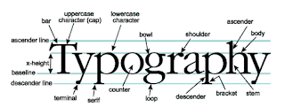
- and many more! Use the image below for a refresher for the parts of type.

The trick is to create ASYMMETRICAL BALANCE, using everything you've learned so far about visual hierarchy and the various principles of art to create a layout that is interesting to see, but also clear to read as well. Those of us who are truly great at art making need to also be great at laying out type on a page. They go hand in hand, especially in doing the most important thing we do in art -- showcasing our work to others.
STEP 3: Arranging type and manipulating leading, kerning, and tracking.
If you look at the character tools above, you also have options for kerning, tracking, and leading.
To review:
- Kerning: The amount of space between each individual character.
- Leading: The amount of space between a single line.... such as the space between the kerning definition here, and the leading definition.
- Tracking: The amount of spacing each letter has in the entire paragraph. Good for making large uniform adjustments.
A couple introductory rules of thumb:
Small text needs wider leading or tracking to be well read, and large text can sometimes benifit from less tracking.
With larger text, it is a good idea to manually modify the kerning between each letter by HOLDING OPTION + ARROW KEYS LEFT OR RIGHT
Here is a link that offers a more indepth example of the three, with images: http://www.designtheplanet.com/typography-101-kerning-and-leading/
STEP 4: Making multiple designs:
If you need to, you can use the ARTBOARD TOOL (SHIFT+O) below to create new artboards on the fly. This may help with making multiple layout designs for the same image.
- Click the artboard tool.
- Make sure all of your layers are unlocked.
- Locked layers will not duplicate the work in them to the new artboard.
- Hold option and shift. Click the artboard you're currently working on and hold.
- Drag out as many artboards as you need, and manipulate your type and images as needed.
You can also do all of these things in landscape!
Below you can see one image I made, as well as what my desktop looked like. There are a bazillion and one ways to lay out text and image. I was very impressed with what was created in class by everyone, and I'm excited to see how you use type in the future!

Sunday, November 10, 2013
Reminder for today: Project 7.5: Super tutorial awesomeness!
1. Find one tutorial in adobe illustrator online! This tutorial can be on creating anything at all, so find something that interests you that you would like to make in Adobe Illustrator!
Finding tutorials is as easy as clicking the links I've posted below, or google searching "cool illustrator tutorials!"
2. Follow the tutorial to create whatever cool object or idea in the tutorial you are trying to make.
3. Use the skills you learned in the tutorial to create something awesome! Print out what you create and have it ready to critique at 9:00! Bring both illustrator files to class!
This will lead into project 8, where we will make instructables! Or rather, learn better functions in illustrator by teaching each other, in addition to extra techniques I teach in class!
Monday, November 4, 2013
Due on Wednesday, Nov 6th!
Continue working on your infographic!
Your final infographic is due, FULLY PRINTED at 11:35 on Wednesday!
Your final infographic is due, FULLY PRINTED at 11:35 on Wednesday!
Wednesday, October 30, 2013
Due Monday, Nov 4th!
DUE FOR NOV 4TH:
1. Have your info graphic, completed, printed BEFORE 9:00, and ready to turn in!
2. Bring your .ai file to class to work in!
Remember:
If your project is not printed when class starts, it is considered LATE!
If your project is not printed when class starts, it is considered LATE!
Furthermore, if it is turned in late, your letter grade drops by 2 grades instead of 1!
----------------------------------
Extra notes for transforming your objects, in case you want more fidelity than the "free transform" tools:
USING THE TRANSFORM OPTIONS:
You can manually transform objects by going to OBJECT ----> TRANSFORM, and then selecting one of the following:
- MOVE…
- ROTATE…
- REFLECT...
- SCALE…
- SHEAR…

The example above is the window for TRANSFORM ----> MOVE.
Once you select these objects, you can manually enter in the amount of space you want to transform your object. Hitting preview will help you see what your image looks like before it is transformed. From there you have two options:
Clicking "OK" will transform your object as desired.
Clicking COPY will make a second copy of your object where you transformed it.
You can repeat these transformations by hitting COMMAND + D.
Clicking "OK" will transform your object as desired.
Clicking COPY will make a second copy of your object where you transformed it.
You can repeat these transformations by hitting COMMAND + D.
Monday, October 28, 2013
Notes for 10/28
TOOLS NEEDED FOR PROJECT:
1) Shape Tool (M)
2) Pen Tool ℗
3) Type Tool (T)
4) Brush Tool* (B)
5) Direct Selection Tool (A)
6) Selecton Tool (V)
7) Layers Tab
8) Pathfinder Tab
9) Eyedropper Tool: (i)
--------------------------------------------------------
Hotkeys for Tools:
A) UNDO: (COMMAND + Z)
B) REDO: (SHIFT+ COMMAND + Z)
1) Rotate: (R key)
2) Deselect: (SHIFT + COMMAND + A)
3) Group: (COMMAND + G)
--------------------------------------------------------
IMPORTANT FUNCTIONS TO REMEMBER:
Importing images from your computer:
FILE ------> PLACE
Using the 3D tool:
EFFECT -------> 3D ------> EXTRUDE AND BEVEL
(rotate and revolve works as well, with different results)
Parameters for Project 7: Infographics and Time Management!
You will be graded on the following:
- Clarity of the message and information presented.
- Cleanliness and Craftsmanship.
- Visual hierarchy of information.
- Overall alignment and spacing of elements of the image.
For those of us that may still be a bit confused on what makes a great infographic, here is a handy resource that may shed some light on the matter, coincidentally, made as an infographic in its own right.
A good infographic has 4 things working together in harmony:
- Data: What is the information I want to present? How much information gets my point across without feeling lacking or too overwhelming?
- Design: How is the information of my infographic presented? Is it easy to understand?
- Story: What is the overall message of my infographic? How do I get that message across?
- Shareability: Is it easy to pass on to others without being overly confused about the information presented?
If you have some of one, but are lacking in others, you may find yourself with an infographic that is not as effective as it could be. This is represented in the graph with the amount of each of the four outside circles fluctuating in visibility and taking up less space in the inside circles.
Personally I believe this particular infographic could be improved upon. As you complete this project and polish up your skills in illustrator, ask yourself what you would do to improve on this example!
Helpful Information for Learning Adobe Illustrator!
In class today, we will review what we've covered so far, and how those skills can lead to you making amazing work in Adobe Illustrator!
Click this link for a list of hotkeys!
Click this link for a list of hotkeys!
(There is a very descriptive menu that helps with finding the hot keys you're looking for!)
The webpage is called (45 Fresh And Best Adobe Illustrator Tutorials.)
One of the best and most economically sound examples of using Illustrator in practical application!
Notes about Illustrator to remember:
The greatest strength of illustrator is that we create images in it using VECTOR GRAPHICS!
Vector Graphics scale up and down without limit! That is, we can scale our images as big or as small as we want without pixelated or jagged edges! It definitely comes in handy when wanting to make a design and use it in as many places as possible, including the aforementioned Teefury website. Many an artist has made money selling designs to "graphic tee" websites like Teefury.
As a point of contrast, Photoshop works with RASTER GRAPHICS, which are compiled through many tiny pixels, as opposed to the mathematical equations that create vectored images.
With varying degrees of success, you can Vectorize a Rasterized Image. There may be some loss of color information when you do. You can also Rasterize a Vectorized Image, but will lose the ability to scale infinitely.
With varying degrees of success, you can Vectorize a Rasterized Image. There may be some loss of color information when you do. You can also Rasterize a Vectorized Image, but will lose the ability to scale infinitely.
Wednesday, October 23, 2013
Assignment for October 28th! (Homework at bottom of post)
Project 7: Infographics and Time Management!
Our next project will be one that merges artwork creation and technique with practical application! As freshmen, your first semester is full of moments where we succumb to the pressures of juggling our lives and maintaing a keen sense of time management. We have trouble meeting deadlines, and sometimes arrive to school with next to know energy. As our first Illustrator-only project, we will create infographics that document the way we spend our time each week! As we work on this project, you will become more aware of the true amount of time each of us have, and come up with ways you can better allocate your time! Phase one of the project is indicated below.
---------------------
Infographics are defined as:
in·fo·graph·ic
ˌinfōˈgrafik/
noun
plural noun: infographics
- 1.
a visual image such as a chart or diagram used to represent information or data.
"a good infographic is worth a thousand words"
-----------------------
Their use has risen in prominence over the years, and now you are able to find info graphics just about anywhere on the internet! As a point of reference here are some websites with tons of info graphics for examples! You can find more with a quick google search.
- http://blog.visual.ly/20-great-infographics-of-2012/
- http://www.creativebloq.com/graphic-design-tips/information-graphics-1232836
- http://trendland.com/10-great-infographics-for-graphic-designers/
- http://readwrite.com/2013/06/10/5-tools-for-creating-your-own-infographics#awesm=~ol6spFPC6tpvUQ
- http://www.good.is/infographics
--------------------------------------
For homework:
Part 1: Research
A. Find 3 info graphics that are indicative of the level of polish and quality you want to achieve in your work in illustrator. Look for these things when selecting your image:
- Clarity of the message and information presented.
- Cleanliness and Craftsmanship.
- Visual hierarchy of information.
- Overall alignment and spacing of elements of the image.
B. After you select each image, save a copy to bring with you to class. Write on your blog why you selected each image. What about the information presented appeals to you? What were you first attracted to when viewing the graphic-- the way the information was presented, or the information itself.
Part 2: Documentation and information gathering.
A. Open up microsoft excel. Create a table that documents your life on a weekly basis. I will review creating things in microsoft excel on Monday, but for those of you that missed class today, remember these things:
- You can click on a square to type into it. You can navigate around each cel with the arrow keys on the keyboard.
- You can change the alignment of the type, and the font the same way you can in Microsoft Word.
B. Your table should be divided by each day of the week, and divided along the edges by 30 minute increments, similar to the example below.
(edit: noticed my image was not uploaded until 5:53, Thursday. So sorry!)

C. Fill in the chart with Details on how you spend each block of time during your week. More detail is better! We will use this information to create your infographic!
Part 3: Creation of your infographic
Start work on your infographic project! Come up with an idea for how you want to convey the information presented, draw up some sketches, and begin work on your project in Adobe Illustrator!
Wednesday, October 16, 2013
Due for Monday: October 16th
Congrats on making it through the first half of Digital Foundations! Over the fall break, you will need to do two things for our next project:
Project #6: Making Comics: The Freshman Experience/ My Life as an Art Student
Objective: Create a comic about your time at MCA so far!
- Minimum number of pages: 1
- Maximum number of pages: 2
All of the projects we have done so far have touched on the many different disciplines at MCA. The next one we cover will be Illustration.
The comics medium is used to tell stories, where each panel indicates a passage of time. When words and speech bubbles come together, it creates a moving story where we perceive a cohesive story is taking place in front of our very eyes.
For this project, you will be asked to create a sequential narrative (comic) about your experience at MCA so far! Use the internet as a reference for the variety of comic styles and layouts out there, and create one that best describes your personal experience.
This project will be our first project to incorporate adobe illustrator. Because of that, you are asked to complete the general layout of your comic and any images you need for it in photoshop, then use illustrator for laying out your text.
-----------------------
Ways of creating your comic:
- Draw then scan into photoshop.
- Draw directly into photoshop.
- (The more experimental take:) Draw your work in illustrator. We have not covered the majority of tools yet, but you are free to experiment if you choose!
- HAVE A .PDF, .JPG, or .PNG OF THE COMPLETED COMIC TO TURN IN BY 9:00 MONDAY MORNING!
Have a great weekend!
Monday, October 7, 2013
Midterm Expectations! (AND MINI PROJECT DUE AT THE END OF CLASS ON WEDNESDAY, OCTOBER 9TH!)
Your blog must be completed to this date!
Have documentation of
- Your first assignment (blocking shapes in photoshop)
- Your self portrait
- Your ideal landscape
- Your gestalt artist research
- Your gestalt principles project
- both version 1 and 2
- Your typography project
- Include on the blog:
- The parameters discussed for each project
- What was your initial idea? What colors did you choose to use? Which tools did you use to create your project? What did you learn from making each project? How well do you feel you understand photoshop at this point? Excellently, Satisfactory, Unsatisfactory?
- Include any images (including your final image for your assignments!)
-----------------------------------------------------------------------------
Midterm assignment! (DUE AT THE END OF CLASS ON WEDNESDAY!)
- Create one image in photoshop… the theme is "dealer's choice," meaning that you can create anything you want! Use it as an opportunity to make something in line with your interests! Create something you want to make that demonstrates use of all the skills we've covered so far.
- On the blog, post your image, and mention which skills you are applying to your project!
Wednesday, October 2, 2013
To be completed by Monday! (OCT 7, 2013)
1. Have your typography project PRINTED, and ready for critique at 9 AM!
2. Between now and Monday, please complete the in class critiques mentioned in the previous posts below, getting two people to critique your work. Write what their opinions were, print it out, and turn in to me in class!
To recap:
2. Between now and Monday, please complete the in class critiques mentioned in the previous posts below, getting two people to critique your work. Write what their opinions were, print it out, and turn in to me in class!
To recap:
- 1) Someone you know well in class.
- 2) Someone you do not know well in class.
This is a good chance for you to get to know your classmates a little better, and gain a fresh perspective of the work you are doing!
- Make note of their comments! (Typed, or handwritten.) Structure your critiques of the work in a sliding scale of 5 comments, based on the following:
- 1st: What is the most successful thing about your image? (STORYTELLING) (+ +)
- 2nd: (+)
- 3rd: (*) Something working, but still needs to be refined further.
- 4th: (-)
- 5th: What is the thing that needs the most improvement in your image? (- -)
- Afterwards, write a couple sentences about what you learned, and what you plan to improve for the second draft of your project.
Monday, September 30, 2013
For Wednesday! (10/2/13)
- First, make sure the first draft of your project is in the server folder, titled "lastname_p4." Second, make sure you save a new version of your project for your second draft, titled "lastname_p4_ver2".
- Continue working on your first draft of your typographic piece! I believe everyone is working with interesting ideas, and they are coming together with some general success. Think about the different parts of your text, and think about how aligning your characters together (as figures, shapes, and against each other) can push the quality of your work.
- On class on Wednesday, we will check each other's progress and provide feedback to improve our work! IMPROVE THESE IMAGES BETWEEN NOW AND WEDNESDAY!
- And as always, email me if you have any questions!
Wednesday, September 25, 2013
For MONDAY! (9/30/13)
A) Make sure you uploaded versions 1 and 2 of the last project to your blog, along with your write-up of the choices you made when creating them. Also make sure the Gestalt Research you did (finding one artist that uses one of the principles... (see below) is on your blog for grading.
1) Find one typeface that appeals to you. This can be one you choose for your artwork or one that's entirely different! Find out when it was created, and it's origin. (Who made it, and if you can, where do they live? What was it first used for? Publications? Building signs? What?)
1) Find one typeface that appeals to you. This can be one you choose for your artwork or one that's entirely different! Find out when it was created, and it's origin. (Who made it, and if you can, where do they live? What was it first used for? Publications? Building signs? What?)
Write about how it appeals to you, and find one example of where it is used in the world. (can be done with a google search for the typeface)
2) Start work on Project 4 (see the post below for details), and bring your first draft to class on Monday, along with your song, lyrics, and any questions you may have!
3) Email me if you have any questions! Have a great weekend!
2) Start work on Project 4 (see the post below for details), and bring your first draft to class on Monday, along with your song, lyrics, and any questions you may have!
3) Email me if you have any questions! Have a great weekend!
PROJECT 4: Music and Typography! (1st draft due Monday,9/30/2013 )
PROJECT DESCRIPTION:
You will create a typographic image that illustrates the meaning behind the lyrics of your favorite song. We will begin to talk about the use of different typefaces, as well as proper naming of the different parts that make up a line of type. You will be responsible to locate and use typefaces(fonts) that add to the overall atmosphere.
Parameters for the project:
RESOURCES and READING MATERIALS:
Resources for typefaces to download:
Examples of type used in other forms of media:
Controversial examples of bad typesetting (there are many opinions, this author summarizes many of them):
---------------------
RESPONSIBILITIES FOR MONDAY (bring the song to play in class, or youtube link!)
You will be responsible for creating the first draft of your project which will be due next monday. (Digital copy only.) In class on Monday, we will continue working on these projects, and you will be asked to acquire feedback from 2 of your classmates:
If you feel you do not know anyone too well, use this as an opportunity to meet someone new! By the end of class on Monday, I will ask you to turn in your first draft, along with written documentation of the feedback for your first version of the project.
You will create a typographic image that illustrates the meaning behind the lyrics of your favorite song. We will begin to talk about the use of different typefaces, as well as proper naming of the different parts that make up a line of type. You will be responsible to locate and use typefaces(fonts) that add to the overall atmosphere.
Parameters for the project:
- You can only use a maximum of three(3) typefaces, comprised of any of the ones immediately available on the computer.
- Any that you download under creative commons licenses. Make sure the typeface is free to use for individual purposes, without copyright infringement!
- You are free to use any color scheme you choose. As always, make note of your color choice!
- You are NOT ALLOWED to use any EXTERNAL IMAGERY! You can create small decals and forms in photoshop to ENHANCE your TYPE, but 98% of the image must be made up of smart typesetting and color choices.
RESOURCES and READING MATERIALS:
Resources for typefaces to download:
Examples of type used in other forms of media:
- http://www.typographyserved.com/
- http://welovetypography.com
- http://artofthetitle.com
- You can find others by doing a quick search of "good" typography in google.
Controversial examples of bad typesetting (there are many opinions, this author summarizes many of them):
- http://listverse.com/2012/06/24/top-10-typography-crimes/
- http://designtaxi.com/article/101998/50-Shades-Of-Bad-Typography/
---------------------
RESPONSIBILITIES FOR MONDAY (bring the song to play in class, or youtube link!)
You will be responsible for creating the first draft of your project which will be due next monday. (Digital copy only.) In class on Monday, we will continue working on these projects, and you will be asked to acquire feedback from 2 of your classmates:
- 1) Someone you know well in class.
- 2) Someone you do not know well in class.
This is a good chance for you to get to know your classmates a little better, and gain a fresh perspective of the work you are doing!
- Make note of their comments! (Typed, or handwritten.) Structure your critiques of the work in a sliding scale of 5 comments, based on the following:
- 1st: What is the most successful thing about your image? (STORYTELLING) (+ +)
- 2nd: (+)
- 3rd: (*) Something working, but still needs to be refined further.
- 4th: (-)
- 5th: What is the thing that needs the most improvement in your image? (- -)
- Afterwards, write a couple sentences about what you learned, and what you plan to improve for the second draft of your project.
Monday, September 23, 2013
For Wednesday!
Our next project will be our first foray into typography and graphic design! To begin work on your first iteration of this project, you will need the following:
Class on Wednesday will be as follows:
You will create a typographic image that illustrates the meaning behind the lyrics of your favorite song. We will begin to talk about the use of different typefaces, as well as proper naming of the different parts that make up a line of type. You will be responsible to locate and use fonts that add to the overall atmosphere. We will cover examples of good and bad typographic design to help you do this.
DUE ON MONDAY:
You will be responsible for creating the first draft of your project which will be due next monday. (Digital copy only.) In class on Monday, we will continue working on these projects, and you will be asked to acquire feedback from 2 of your classmates:
If you feel you do not know anyone too well, use this as an opportunity to meet someone new! By the end of class on Monday, I will ask you to turn in your digital copy, along with documentation and feedback for your first version of the project.
- The lyrics to your favorite song of choice.
- An mp3, or youtube link to your favorite song.
- Check out this link for an introduction to type and type terminology: http://graphicdesign.spokanefalls.edu/tutorials/process/type_basics/We will cover these terms in class after our primer in photoshop.
Class on Wednesday will be as follows:
- 9:05 - 10:25: Watching Movie: Helvetica
- 10:30 - 11:35: Demonstration of type tools in photoshop, and masking. (Rudimentary in-class work period for your next project!)
You will create a typographic image that illustrates the meaning behind the lyrics of your favorite song. We will begin to talk about the use of different typefaces, as well as proper naming of the different parts that make up a line of type. You will be responsible to locate and use fonts that add to the overall atmosphere. We will cover examples of good and bad typographic design to help you do this.
DUE ON MONDAY:
You will be responsible for creating the first draft of your project which will be due next monday. (Digital copy only.) In class on Monday, we will continue working on these projects, and you will be asked to acquire feedback from 2 of your classmates:
- 1) Someone you know well in class.
- 2) Someone you do not know well in class.
This is a good chance for you to get to know your classmates a little better, and gain a fresh perspective of the work you are doing.
- Make note of their comments! Structure your critique of your work in a sliding scale of 5 comments, based on the following:
- 1st: What is the most successful thing about your image? (STORYTELLING) (+ +)
- 2nd: (+)
- 3rd: (*) Something working, but still needs to be refined further.
- 4th: (-)
- 5th: What is the thing that needs the most improvement in your image? (- -)
Wednesday, September 18, 2013
To be completed for Monday!
1) Make sure all of your work is printed BEFORE class! Punctuality is key in your classes!
2) Create a revised, second iteration of your artwork. We reviewed everyone's in class and gave feedback on what could be changed and altered to further communicate our ideas. Everyone has at least one or two things they can do to solidify their idea. If you feel your original is solid, use this as an opportunity to try to create a new one as an experiment!
Use this as a chance to push your idea farther and better execute your project! Everyone's use of the Gestalt Principles was very solid, as well as the pen tool. Overall, the class as a whole is getting a lot better at using visual terminology to pinpoint different elements of our work. Great job!
2A)For those of you that were absent, upload version 1 to the server, into my dropbox folder for grading. We did critique today, and class participation is always part of your grade. You are still responsible for Version 2 on Monday for critique. Ask one of your classmates for details if #2 above is unclear.
3) Print out your next version and bring BOTH version 1 and version 2 to class for critique @9AM! You will only receive full credit for both iterations of your project if you turn in both of them on time, on Monday!
--------------------------------------------------------------------------
Have a great week! Going forward, the last major branch of photoshop we need to cover is masking. So we will be using the last couple weeks before we switch to illustrator to hone the skills we already have. Review the information below if you have any questions about specific processes we have covered in Photoshop, and come to me or email me with questions!
Wednesday, September 11, 2013
Project 3: Important matters of the world: (Flat graphics, Iconic Silhouettes, and the Gestalt Principles Hard at Work)
In the last two projects, we have thought heavily about ourselves -- Who we are today and who we want to become tomorrow. In this next project, we will think; not of ourselves, but of the world around us. There are a lot of things going on in the world. Important causes to get behind, and important matters that we care deeply about. Positive ones, negative ones, and everything in between.
What I want you to do for this next project is bring to light an important matter of the society we live in. You are free to pick a positive OR negative happening… or even go the route of selecting a scenario that may bring or is bringing about both positive and negative change.
Once your idea is selected, you will create an image, 8.5 x 11 in size, with 1/4 inch margins that demonstrates this cause. What it is, and why it's important!
Parameters to follow:
1) Your final image must be composed ONLY of silhouettes!
2) You must use at least 12 elements (as in 12 shapes) in your image somehow! You can create the shapes or figures you want.
3) As always, select a color scheme to use, and make sure you let us know the colors you decide to use!
4)It must be printed before class on Tuesday!
5) You must demonstrate at least 2 of the gestalt principles in your image!
6) You will be graded on the following:
- Clarity of the message. How easily can we pick up on what the crisis is?
- Usage of tools covered in class.
- Craftsmanship
- Proper layer naming and usage!
- Description of your work on your blog!
Thursday, September 5, 2013
Recap of Wednesday's Class (Assignments Due, and Printing Demo)
A) Print your first and second projects for final critique on Monday. Below is an overview for printing your work!
1) Go to this website and read about the Gestalt Principles of Visual Perception: http://graphicdesign.spokanefalls.edu/tutorials/process/gestaltprinciples/gestaltprinc.htm
Additional resources for the gestalt principles are at the following links:
2) Select 1 Gestalt Principle for your focus.
3) Find 1 artist that exemplifies one of the Gestalt Principles in his/her artwork.
4) Write a short paragraph on your blog explaining how the artist uses the principle to create his/her image.
Note: This is a precursor to your next project! We will be studying these principles and using them to create some great works of art in Photoshop!
----------------------------------
PRINTING DEMONSTRATION RECAP!
For those of you who were absent on Wednesday, or need a refresher, here are abbreviated instructions for printing on the large format printer! As a reminder, you are printing from the EPSON 4900 printer, the large one next to the window in the back of the class.
Materials:
To print you will need: (should be no more than $1.50, and can be bought from the store downstairs, or the art center on Union Avenue)
(you may need to purchase some extra sheets for printing in case of mistakes)
STEP 0: Save your work and open it on the computer next to the printer. You should be able to log into your file.
Step 1: SAVING YOUR PHOTOSHOP FILE:
 Here is an image I had of my saved psd file. The guides I set along the edges help me designate an area of "bleed", that is an area that I know isn't going to be printed by the printer. (The printer should print with at least a quarter inch of space.
Once your image is complete, go to FILE ---------> PRINT: The next dialouge box should come up.
Step 2: ADJUSTING YOUR PRINT SETTINGS:

Take note of the Settings under Printer setup and Color Management. You will need them set like the image above.

You will need to adjust the POSITION and SIZE to center your image on the paper. At default, photoshop pushes your image slightly off screen for printing. To adjust:
Step 3: After setting that, click the print settings button at the top of your printing window:
At the bottom, click the "show details" button so you see the following:

A) The most important thing to check for is your PAPER SIZE. Click the drop down menu and select one of the following, depending on the project you are printing:

B) Once selected, click the LAYOUT BUTTON. You will see a drop down menu.
C) SELECT PRINTER SETTINGS:


Last but not least, your Paper Handling should be selected as such.

STEP 4: PLACING YOUR PAPER INTO THE PRINTER!
On the printer, there is a little sticker that will show you how to insert your paper.
Once you have your paper. Insert it into the back tray (the open one on the back of the printer.) Set your paper as close to the right side as possible, and adjust the slider as needed to keep your paper steady. Your paper will need to be placed in PORTRAIT STYLE (long edges going side to side, other edges going top to bottom.)
Click PRINT.
You will have to press the "Down Arrow Key" On the printer to feed your paper into the printer. It will warm up, then adjust your paper for printing. After that, you should soon have your printed images!
POTENTIAL ISSUES:
Q: It says my paper is jamming! What do I do!?
A: Large Printers can be finicky sometimes. Follow the instructions on the printer's screen to remove your paper. (Press the up arrow key on the printer to remove the paper.) DO NOT TRY TO PULL IT OUT UNTIL IT IS FREE FROM BEING UNDERNEATH THE WHEELS!
If you do, you may rip your paper and damage the printer!
Make sure that your paper is set low enough that it is touching the round wheels, then press down to have it feed into the printer. If you need any help, feel free to ask someone nearby! While our printer is new, there are many students in the school that have tons of experience with the larger printers.
Q: Someone is using the printer, but I need to print! What do i do!?
A: There is another printer next door in Mac Lab 2! It works the same way. Just bring your file to the computer, and print from it, checking for settings and the like.
Q: It says that my paper is empty, but I placed it in the printer!
A: Make sure that your paper is placed touching the wheels! It needs to line up evenly with them so that the printer can align your image to the paper's dimensions.
Q: I've been here hours, and this thing just won't print!
OPTION 1: The printing layout has a "sweet spot" you need to set for printing. The biggest issue is that the printer does not recognize your paper as properly aligned to the print head. Make sure it is set low enough, and placed all the way to the right of the printer.
OPTION 2: You can try using one of the bottom trays for printing. Pull out the bottom tray of the printer and set your paper inside the tray, using the guides on the printer for aligning your paper. The printer should be able to auto-detect the paper inside. If not, you will have to use window on the printer and manually tell it which tray to print from.
OPTION 3: You can try printing using the "Fiery Printer" (The big blue one that says NOVACOPY.)
I have not covered printing from this printer yet, due to some students not having server accounts to use to print as of yet. But for those of you that do have print cards, or have not received one and want to get one, follow the instructions at this link:
http://mca.edu/labs/?p=27
Keep in mind that this is a last resort for printing for this project. Part of the class curriculum involves mastery of the tools we cover in class, even the more complicated, stubborn, finicky ones. The printers are your friend, even if they do not want to act like it sometimes.
As always, contact me if you have any questions!
1) Go to this website and read about the Gestalt Principles of Visual Perception: http://graphicdesign.spokanefalls.edu/tutorials/process/gestaltprinciples/gestaltprinc.htm
Additional resources for the gestalt principles are at the following links:
- Practical Application of the Gestalt Principles: http://sixrevisions.com/web_design/gestalt-principles-applied-in-design/
- Wikipedia's Overview on Gestaltism: they psychology behind our brain's method of grouping images together: http://sixrevisions.com/web_design/gestalt-principles-applied-in-design/
2) Select 1 Gestalt Principle for your focus.
3) Find 1 artist that exemplifies one of the Gestalt Principles in his/her artwork.
4) Write a short paragraph on your blog explaining how the artist uses the principle to create his/her image.
Note: This is a precursor to your next project! We will be studying these principles and using them to create some great works of art in Photoshop!
----------------------------------
PRINTING DEMONSTRATION RECAP!
For those of you who were absent on Wednesday, or need a refresher, here are abbreviated instructions for printing on the large format printer! As a reminder, you are printing from the EPSON 4900 printer, the large one next to the window in the back of the class.
Materials:
To print you will need: (should be no more than $1.50, and can be bought from the store downstairs, or the art center on Union Avenue)
- 1 sheet of Epson 8.5" x 11" paper (matte or glossy quality paper)
- 1 sheet of Epson 11" x 17" paper (matte or glossy quality paper)
(you may need to purchase some extra sheets for printing in case of mistakes)
STEP 0: Save your work and open it on the computer next to the printer. You should be able to log into your file.
Step 1: SAVING YOUR PHOTOSHOP FILE:

Once your image is complete, go to FILE ---------> PRINT: The next dialouge box should come up.
Step 2: ADJUSTING YOUR PRINT SETTINGS:

Take note of the Settings under Printer setup and Color Management. You will need them set like the image above.
- Color Handling determines what measuring stick the printer will use for your range of color.
- Letting Photoshop Manage your colors keeps things looking as accurate as possible!
- For your positioning and size on the other hand, refer to the image below:

You will need to adjust the POSITION and SIZE to center your image on the paper. At default, photoshop pushes your image slightly off screen for printing. To adjust:
- Uncheck the "Center" button under Position.
- Set Top and Left to 0.
- Keep Scale at 100%, since we are working with the full size of the paper in mind.
- AS A SMALL NOTE, if you notice when printing, that your image is uneven, try setting your position to the following settings:
- TOP: -0.125
- LEFT: 0
Step 3: After setting that, click the print settings button at the top of your printing window:
At the bottom, click the "show details" button so you see the following:

A) The most important thing to check for is your PAPER SIZE. Click the drop down menu and select one of the following, depending on the project you are printing:

- For Project 1: US Letter (sheet) (8.5 by 11 inches)
- For Project 2: US B 11x 17 in (11 by 17 inches)
B) Once selected, click the LAYOUT BUTTON. You will see a drop down menu.
C) SELECT PRINTER SETTINGS:


- You may find you need to change the media type between Glossy and Matte Paper settings. This adjusts the printer's printing method to better render your image.
- Your page setup should be set to sheet. There are settings for "roll paper," and you may sometimes use the printer after another student has used the printer in this way. Make sure there are no "roll paper" settings selected.
Last but not least, your Paper Handling should be selected as such.

STEP 4: PLACING YOUR PAPER INTO THE PRINTER!
On the printer, there is a little sticker that will show you how to insert your paper.
Once you have your paper. Insert it into the back tray (the open one on the back of the printer.) Set your paper as close to the right side as possible, and adjust the slider as needed to keep your paper steady. Your paper will need to be placed in PORTRAIT STYLE (long edges going side to side, other edges going top to bottom.)
Click PRINT.
You will have to press the "Down Arrow Key" On the printer to feed your paper into the printer. It will warm up, then adjust your paper for printing. After that, you should soon have your printed images!
POTENTIAL ISSUES:
Q: It says my paper is jamming! What do I do!?
A: Large Printers can be finicky sometimes. Follow the instructions on the printer's screen to remove your paper. (Press the up arrow key on the printer to remove the paper.) DO NOT TRY TO PULL IT OUT UNTIL IT IS FREE FROM BEING UNDERNEATH THE WHEELS!
If you do, you may rip your paper and damage the printer!
Make sure that your paper is set low enough that it is touching the round wheels, then press down to have it feed into the printer. If you need any help, feel free to ask someone nearby! While our printer is new, there are many students in the school that have tons of experience with the larger printers.
Q: Someone is using the printer, but I need to print! What do i do!?
A: There is another printer next door in Mac Lab 2! It works the same way. Just bring your file to the computer, and print from it, checking for settings and the like.
Q: It says that my paper is empty, but I placed it in the printer!
A: Make sure that your paper is placed touching the wheels! It needs to line up evenly with them so that the printer can align your image to the paper's dimensions.
Q: I've been here hours, and this thing just won't print!
OPTION 1: The printing layout has a "sweet spot" you need to set for printing. The biggest issue is that the printer does not recognize your paper as properly aligned to the print head. Make sure it is set low enough, and placed all the way to the right of the printer.
OPTION 2: You can try using one of the bottom trays for printing. Pull out the bottom tray of the printer and set your paper inside the tray, using the guides on the printer for aligning your paper. The printer should be able to auto-detect the paper inside. If not, you will have to use window on the printer and manually tell it which tray to print from.
OPTION 3: You can try printing using the "Fiery Printer" (The big blue one that says NOVACOPY.)
I have not covered printing from this printer yet, due to some students not having server accounts to use to print as of yet. But for those of you that do have print cards, or have not received one and want to get one, follow the instructions at this link:
http://mca.edu/labs/?p=27
Keep in mind that this is a last resort for printing for this project. Part of the class curriculum involves mastery of the tools we cover in class, even the more complicated, stubborn, finicky ones. The printers are your friend, even if they do not want to act like it sometimes.
As always, contact me if you have any questions!
Subscribe to:
Posts (Atom)