Thursday, March 27, 2014

Assignment for Tuesday!

A. Experiment:  Use what we learned about typography in class to create a image that covers the ABC's of typography:  ARRANGEMENT(placement), BALANCE, AND COMMUNICATION.

Think of it as this: You are making a message to go on a T-shirt. What would that message be? How would you show it?

This is just like the experiment we did in the last half of class today.  With only words, and the placement of those words, use what you know about type to create a message that communicates an idea.  The image i created in question simply used the words "Tacos are Awesome."  This is a chance for you to experiment with typographic design. You have http://www.lipsum.com if you need placeholder text, but the final image must have text that creates a clear message.   You may use any colors you choose.

B.  Begin research for your Infographics project!  Below is information that recaps what I covered in class today, plus a little extra for what you need on Tuesday.

Infographics are defined as:

in·fo·graph·ic
ˌinfōˈgrafik/
noun
plural noun: infographics
  1. 1.
    a visual image such as a chart or diagram used to represent information or data.

    "a good infographic is worth a thousand words"
-----------------------

Their use has risen in prominence over the years, and now you are able to find info graphics just about anywhere on the internet! As a point of reference here are some websites with tons of info graphics for examples! You can find more with a quick google search.


--------------------------------------
For homework:

Part 1:  Research
A.  Find 5 info graphics that are indicative of the level of polish and quality you want to achieve in your work. Look for these things when selecting your image:
  • Clarity of the message and information presented.
  • Cleanliness and Craftsmanship.
  • Visual hierarchy of information.
  • Overall alignment and spacing of elements of the image.

B.  After you select each image, save a copy and post them to your blog. Write on your blog why you selected each image.  What about the information presented appeals to you?  What were you first attracted to when viewing the graphic-- the way the information was presented, or the information itself?

Part 2: Documentation and information gathering.

A.  Create a table that documents your life on a weekly basis.  It will help to divide the time each day into thirty-minute chunks.  I created an example below of how we will catalogue this information in class on Tuesday.


As always, email me if you have any questions! If we did not critique your project today, we will critique it on Tuesday

Thursday, March 20, 2014

Project 4: Movie Posters!

Movie posters, in the history of cinema, must find ways to create a compelling story that makes the viewer think "I want to see more of this."  It's an evolution of what we've done in art galleries for hundreds, if not thousand of years - interact with a work of art, and imagine what happens beyond the surface.

While we have a solid understanding in creating compelling images, we have yet to break down the way artists integrate type into artwork seamlessly.  If you do not know anything about type, it is easy to write off text as simply "placing it on paper, and moving along."  There is a lot more to it than that.

After watching Helvetica, you are tasked with creating a movie poster using your new knowledge of typography and photos of your paper craft characters!  This is a short project that gives us the chance to use text and image in ways we never thought possible!

Over the weekend, you will have a chance to do that!  You will need to do the following:

A. Create a new file in Photoshop:  
Orientation: Portrait 
Dimensions: 11 inches (width) x 17 inches (height).  
Resolution: 300 DPI.

1.  Create a design for your movie poster! Use a combination of photography, color correction, and moving objects around in Photoshop to create an image that evokes the feeling for your character's movie! This design is created by either using your best images from midterm week, or creating new ones based on the idea you are using. Make a composition with those images in photoshop, and arrange them in a way that you are happy with!

2.  Save that image out as a PSD or a PNG, and open it in Illustrator.  Using the few things you learned about typography today, lay out the text for your movie poster in a way that unifies the two elements (text and image) together! This is your first project that teaches you how to work with Photoshop and Illustrator in tandem.

3.  This image will be your first draft.  On Tuesday, have this image printed via the fiery printer and pinned to the wall by no later than 4:45.  As stated in class, you will lose a letter grade for every 2 minutes your work is not up on the wall. This is a way to boost our professionalism and timeliness!

Extra notes:
You can integrate outside elements into your images. Hand-drawn elements, photos, and the like can be used. Using the pen tool and selection tools, you can use imagery you have created from other places to accentuate your image!

If you need additional photos, I will bring the photography materials for Tuesday. 

For grading, I will evaluate the following:

Craftsmanship
Design: Use and Layout of Type.  Are you aligning the type, while giving enough room for your characters?
Clarity of Message: Does your text and image work together to tell an enticing story for your character?
Use of both Photoshop and Illustrator in tandem.  Does the integration of both into your art look seamless?


After bringing these first draft to class on tuesday, and you will have the entire class to work.  The final draft, (Version 2) will be due on Thursday at the beginning of class.  Thursday will be a critique day, where we critique our movie posters, and our paper craft characters. HAVE V2 PRINTED AT THE BEGINNING OF CLASS ON THURSDAY!

Introduction to Typography! =D

RESOURCES and READING MATERIALS:


Check out this link for an introduction to type and type terminology: http://graphicdesign.spokanefalls.edu/tutorials/process/type_basics/  Knowing the different parts of type will give you thousands more options when integrating text into your artwork.


Resources for typefaces to download:


Examples of type used in other forms of media:


Controversial examples of bad typesetting (there are many opinions, this author summarizes many of them):

Monday, March 17, 2014

Introduction to Photoshop!

Welcome back, Class! Here is a very descriptive example of photoshop's basic functions, with hotkeys below.  We will spend some time in class discussing the 5 artists you found over the break.  I have my list of things to teach, but I will tailor the second half of this semester to the work you want to do.

List of shortcuts
Photoshop Tool Basics

---------------------------------
Introduction to Photoshop!

PART 1:

When opening photoshop, always remember to set your dimensions first!  For future projects, I will give the dimensions first and foremost.  You will need the following settings for your Assignment due Monday:


Important tools to remember:
THE TOOLBAR: (Key in parentheses)

  • Move tool (V key): For moving objects around the workspace.
  • Rectangular Marquee Tool (M Key): For making selections.
    • Hold "Option" to remove parts of your selection.
    • Hold "Shift" to add parts to your selection.
  • Brush Tool (B key): For general mark making in photoshop.
  • Eraser Key (E key): For erasing parts of your layer.
  • Paint Bucket Tool (G key): For filling large parts of your image, or filling an entire selection once.

Hotkeys and functions to know:

To resize objects: 
  • Go to EDIT --> Free Transform (Command + T)
  • To resize objects with uniform scale, hold SHIFT when scaling your objects!

COPYING, PASTING, and DUPLICATING.
  • Copy: Command + C
  • Paste: Command + V
  • For rapid duplication of an object:
    •  1) Select the layer of the object you want to move, or if working with multiple objects, select them with the rectangular marquee tool.
    • 2) Select the move tool. (V)
    • 3) Hold option.
    • 4) You can now click and drag your option to create multiple ones on the same layer!

UNDO, STEP BACKWARD, AND STEP FORWARD
  • Undo: Command + Z
    • NOTE! If you need to undo further, Photoshop has a function called "Step Backward," that you can use.  You can undo more than 20 times this way, but the total amount of undos you are  allowed is finite.
  • To use STEP BACKWARD, hold COMMAND and OPTION and press z.
  • To do the opposite and STEP FORWARD, hold COMMAND and SHIFT and press Z.

WORKING WITH LAYERS:
  • To change the opacity:
  • Under the LAYERS tab, click the arrow next to "OPACITY," and adjust the number as needed. 100 is equal to a fully solid image, whereas 0 is completely transparent.

  • To move layers up and down, click on the specific layer, and move as needed. Layers on top are in the foreground, and layers on the bottom are in the background!

COLOR AND SWATCHES:
  • Clicking the large squares in the color tab will open up a COLOR PICKER, that will let you choose from a wide variety of colors. You can also click anywhere in the little strip at the bottom of the color tab to choose colors.  The SWATCHES tab gives you a set of basic colors for editing.

POSTERIZATION:
When using reference materials, it may be easier to make note of the lighting of an image by using the posterization feature. Posterize simplifies the lighting in an image into cells of color.

1) Go to IMAGE -----> ADJUSTMENTS ------> POSTERIZE
2) Drag the slider to select the number of levels that works best for you.

SAVING FILES:

1)Go to FILE -----> SAVE AS

Remember to name your image something pertaining to your project. We will review where to save your files on Monday, so be sure to bring your files to class.

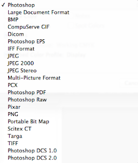
Note:  Save your file as both a photoshop file, and a .PNG file for the web! (See below)

---------------------

PART 2:

List of tools and reminders for what we're covering:  (Hotkeys or shortcuts to them are in Parentheses)

  • Navigator Tab: A shortcut for viewing a thumbnail of your work.
  • Hand Tool (Space): Used for moving around your image when zoomed in.
  • Rulers and Guides: Good for making precise measurements.
  • Show Rulers:  ("Command + R" ,  or "View ------> Rulers")
  • Rotate view tool: (R)  Lets you turn your image like paper!
  • Guides: (View --------> New Guide)
  • Show Grid: ("Command + ' " or  "View --------> Show --------> Guides")
  • Delete Guides: (View -------> Clear Guides)


  • Crop tool: C Used for cropping image.
  • Brushes (B) Used for drawing.  Can change brush size and opacity, can also create brushes too!
  • Changing brush size: ("[" for smaller size, and "]" for larger)
  • Other Marquee Tools (selection tools) at your Disposal:  (Can switch between rectangle and square tools by holding (SHIFT and pressing M)
  • Lasso Tool (L ): Used for drawing a circle around your object and selecting it.
    • Polygonal Lasso Tool: Lets you paint an edged lasso.
    • Magnetic Lasso Tool: Snaps to objects in your layers.
    • Quick Selection Tool : Lets you paint a selection.
  • Pen Tool: Used for drawing shapes, and making complex selections.
    • Can select parts of your path with the PATH SELECTION TOOL (A).
  • Clone Stamp Tool: (S)  Used for making copies of objects.
    • 1. Select cloning tool.
    • 2. Hold option to select what you want to clone.
    • 3. Let go of option, and paint with your tool!
  • Type Tool  (T): Used for adding type to your work.
  • Making Large-Scale Image Adjustments:
  • Blur and Sharpen Tool: Good for altering the focus of an image.

------------------
Image -----> Adjustments
Each adjustment type modifies your image in various ways! Here are the main ones that may be helpful in your next project:

Brightness and Contrast

Hue and Saturation

Color Balance

Making Small-Scale Image Adjustments:
  • Use the marquee tools to select a small spot to change. Then use the ADJUSTMENT TABS to change them.


Experimenting with your Image Adjustments
  • Use the adjustment layers to modify your image in sections.  You can turn these off if you need to. This works for NON-DESTRUCTIVE IMAGE ADJUSTMENTS.


Tuesday, March 11, 2014

Reminder for things due Monday, after spring break:

1. Keep track of your papercraft project. We will bring them back to class the wednesday we come back.

2. Just as you did with your Gestalt Principle research, find 5 (yes, 5) artists who make great work primarily in photoshop. Find people who have work that is like the work you would like to do eventually.  It helps to find a variety of subjects, from type, to portraits, to illustrations, to photos, etc.

Write about each one.  What attracted you to that artist? What do you want to learn about that artist's work? What would you like to do yourself?

This is due for a grade.  What you bring in will dictate the focus of your first few photoshop projects!

Have fun with this! It's primarily research for when we start photoshop!

Continue having a great Spring Break! =D

Tuesday, March 4, 2014

Checklist for Midterms!

On Thursday, you will turn in these projects to me!  On your blog, you must have documentation of the following:

Projects:

  1. Your Self Portrait (p1)
  2. Your artist research for the Gestalt Principles project. 
  3. Version 1 of the Gestalt Principles Project (p2a)
  4. Version 2 of the Gestalt Principles Project (p2b)
  5. The 2-D layout design of your Papercraft Project, with instructions on building your papercraft. (p3a)
  6. Photos of the 3D finished product of your Papercraft Project (p3b)
  7. Any written notes from artist lectures this semester.


Documentation includes the following:

  • An ARTIST STATEMENT about your work.
    • What is your process when creating your assignment?  What was your idea?
    • What tools did you use to create it?
    • What color scheme did you use when creating your project?
    • How do you feel about the finished result? Would you change anything or make improvements if you were to recreate your work of art?
  • PHOTOS of your created works.


    • For extra points:  Showcase your artwork at different stages! It helps better communicate your personal artistic process.  Add sketches, notes of your work, and add any links to artists that inspired you.
In addition to these things, I will want you to turn in the following images to the server in class. In the FD170D folder, you will do the following:
  • Create a folder with your name. If you already have one, great! If not, make one.
  • I need a .PNG image of each project with the following naming convention:
    • "lastname_firstname_pX" (where X is the project number of your assignment.  Refer to the top for the project names in parentheses.)
  • I need a folder with snapshots of your photos for you assignment.

Remember to save your projects, you can save a PDF from Adobe Illustrator by going to File ----> Save As.  To save a .png, open your work in Preview, and go to File -----> Export.