Homework for November 20th (Yes, Due Wednesday @ 9AM! =D ):
As we learned in class,
take two(2) of your past projects, and created printed layouts of your work with type and image, just like we did in class. We made one image in 30 minutes. Creating both should only take about an hour, unless you want to experiment! Below is the example I made:
As a reminder, we are beginning to work more with type, and beginning to learn what is the difference between legible, properly laid-out type, and arbitrary typographic layout that needs improvement. You are free to create any layout you wish and create any grid you want.
I will be looking for the following:
- Arrangement of text and image.
- Your image
- Image Title
- Your name
- An accurate description of your work. You can copy and paste project descriptions from your blog posts if you like.
- Hierarchy of information presented.
- Grid layout and spacing.
- Are you able to explain how your type is laid out?
(Note: Remember, we are using Helvetica!)
Below is a recap of what we covered in class:
---------------------------------------------------------------------
Today in class we covered typographic layout in an introductory fashion! We used a number of tools to create the work above. To begin, we created a new illustrator document. (Letter: 8.5 x 11)
STEP 1
Using the Rectangular Grid tool (Found by clicking and holding the linetool box), we created a grid on the desktop. To create our grid, we clicked on our workspace.
The following image should pop up:
You will want to adjust the default size to the size of your image, and edit the number of horizontal and vertical grid lines (horizontal and vertical dividers). For the example I made in class, we selected 4 for each. This creates a grid made of four lines. This way, we're forced to work without a line of symmetry, and create asymmetrical balance.
After hitting okay, you will want to move the grid into place. You can also click and drag out a grid, but the method previously mentioned lets us create specific dividers and settings.
STEP 2
We used some dummy text for our example, to worry less about what the images are about. The text we used was LOREM IPSUM... click the link below to learn more about it.
Website for Lorem Ipsum dummy text:
http://www.lipsum.com
For the example below, I also made a couple guides to give the image half inch margins all the way around. This helps keep our text on the page. From there, we aligned our type along the grid. As a reminder, remember that one character gives you a myriad of ways to arrange type.
Following that, we opened the character tab by clicking
WINDOWS ---> TYPE -----> CHARACTER in the top menu, to open this window. There are tons of settings for alignment, tracking, and leading for your characters; adjust the parameters of each as needed to lay out your text!
Below: The title has been created with
80pt font, the subheading under the font was aligned along the title's descender line (
16pt font). The paragraph below was created by drawing a text box with the type tool, and setting the type to
11 pt font. We lined up the sub heading and paragraph along the same line as the "m" in "Lorem." This creates an invisible line of action that makes all of the content on the page much easier to read once the text is gone.
To add an extra level of clarity, the title and paragraph both rest their baselines on the grid we created. It is a subtle detail, but with more text on screen it means all the difference between legible type and an incoherent mess.
If you don't see all of these options, know that you can see them by clicking "Show Options" in the menu tab.
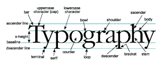
You can arrange...
- along the grid
- along the characters themselves
- along the base line, ascenders, or descenders of your characters
- along the apex of the x-height
- in relation to the edges of your image's frame
- and many more! Use the image below for a refresher for the parts of type.
The trick is to create ASYMMETRICAL BALANCE, using everything you've learned so far about visual hierarchy and the various principles of art to create a layout that is interesting to see, but also clear to read as well. Those of us who are truly great at art making need to also be great at laying out type on a page. They go hand in hand, especially in doing the most important thing we do in art -- showcasing our work to others.
STEP 3: Arranging type and manipulating leading, kerning, and tracking.
If you look at the character tools above, you also have options for kerning, tracking, and leading.
To review:
- Kerning: The amount of space between each individual character.
- Leading: The amount of space between a single line.... such as the space between the kerning definition here, and the leading definition.
- Tracking: The amount of spacing each letter has in the entire paragraph. Good for making large uniform adjustments.
A couple introductory rules of thumb:
Small text needs wider leading or tracking to be well read, and large text can sometimes benifit from less tracking.
With larger text, it is a good idea to manually modify the kerning between each letter by HOLDING OPTION + ARROW KEYS LEFT OR RIGHT
STEP 4: Making multiple designs:
If you need to, you can use the ARTBOARD TOOL (SHIFT+O) below to create new artboards on the fly. This may help with making multiple layout designs for the same image.
- Click the artboard tool.
- Make sure all of your layers are unlocked.
- Locked layers will not duplicate the work in them to the new artboard.
- Hold option and shift. Click the artboard you're currently working on and hold.
- Drag out as many artboards as you need, and manipulate your type and images as needed.
You can also do all of these things in landscape!
Below you can see one image I made, as well as what my desktop looked like. There are a bazillion and one ways to lay out text and image. I was very impressed with what was created in class by everyone, and I'm excited to see how you use type in the future!


