A link to making pamphlet stitch binding: http://www.booklyn.org/education/ispamphlet.pdf
Everyone has created some compelling work this semester! Continue to refine your skills as you continue to future classes! Go forth and make amazing art! Happy holidays! =D
Monday, December 9, 2013

Wednesday, December 4, 2013
DOUBLE SIDED PRINTING INSTRUCTIONS!
Today in class we learned how to do double-sided printing through the fiery print-server. I made a lot of snapshots for you so you have references to refer to. Make sure things are set up like they are here. If you're afraid of running out of money, make sure you buy a new print card from the business office. I will not accept anything that's not fully printed at 9!
STEP 1: Make sure your book is laid out and complete. You will want to have a number of pages equal to any multiple of 4. ( Example: 4, 8, 12, 16.) Everyone's book will probably be around 12 pages. Remember that we are printing pages in multiples of 4 to compensate for the fact that we are printing 2 pages on each side, front and back, equating to 4 pages for every sheet of paper.
(as an added bonus, you're only charged the price of one sheet of printer paper.)
(as an added bonus, you're only charged the price of one sheet of printer paper.)

STEP 2:
Go to FILE ----> PRINT BOOKLET...

The following window will come up. Make sure the following settings are set.

You will want to keep blank pages selected, so any fill pages you have will print properly. Notice that in the image below, your pages must be set to fit properly on an 11x17 (Tabloid) Sheet of paper.

To do this, we must click PRINT SETTINGS....

Each of the important windows is shown here. When you start, notice "GENERAL" Is selected in blue on the right. You will want to make your settings like the one above. If you selected Print Blank Pages in the last window, it should automatically be selected here.
STEP 3:

Click SETUP in the menu on the left. Here you will set your paper size. You will want to set it to either 11x17 or Tabloid (either one will give the same desired result.) Keep the scale set to 100%, as shown above, unless you've been otherwise directed by me due to your layout and portfolio design.

Make sure your page position is set to UPPER LEFT.

(this is just an example of the tabloid setting. Tabloid is just a fancy way of saying 11x17 inches.)

From there, click the "Printer" button at the bottom of the window. In Step 4, we set up the fiery printer and tell it to print double-sided.
STEP 4:
Below is the first window you see. Keep these settings set just like this.

The little bar under "from 1 to 1" can be clicked to show the other settings: Paper Handling and Fiery Features are the most important ones. Under paper handling. Make sure the following is checked, so your pages stack in the proper order.

Then under Fiery Features, make sure you select TRAY 2 under Paper Tray. This makes sure your double-sided page prints right-side-up on both sides. After you select Tray 2, make sure that you set the Duplex (fancy word for double-sided prints) setting to Right and Left Binding, so your work folds properly.

Scroll down, and make sure the settings below are set in the same window.


There you go! If you notice, under page setup, it will share the same paper size as you previously set. Just hit okay and print on every window and you're good to go! Check out the image of your preview above to make sure your work prints the right way. You may make a few mistakes printing, and that's okay. Just bring enough money to print properly.

REMEMBER I NEED 2 COPIES OF YOUR PORTFOLIO! MAKE TWO! AND BE READY TO TURN THEM IN AT 9:00! NO EXCEPTIONS!
Remember to make a folder inside the server's FINAL PORTFOLIO folder. Place all your work in either png or pdf form. Label it as such. Email me if you have any questions!


FOR THE FINAL CLASS!
- Print 2 copies of your final. Bind them up together, and have them ready to turn in at 9:00. No exceptions! =D
- Make a folder on the server. Place a .png file or .pdf file from every project we have created in class.
- Have your blog fully updated! You will need the following:
FINAL BLOG CHECKLIST:
Your blog must be completed to this date!
-
Have documentation of
- Your first assignment (blocking shapes in photoshop)
- Your self portrait
- Your ideal landscape
- Your gestalt artist research
- Your gestalt principles project
- both version 1 and 2
- Your typography project
- Your comics project. (Version 1)
- Your midterm experiment.
- Your info graphic project
- both version 1 and 2.
- Your illustrator tutorial project.
- the first image that you made from a tutorial online
- the second image that you created with the skills you learned
- Your 3 layout tests.
- Notes about your final project.
- Notes about any of the artist lectures you went to this semester!
- Include on the blog:
- The parameters discussed for each project
- What was your initial idea? What colors did you choose to use? Which tools did you use to create your project? What did you learn from making each project? How well do you feel you understand photoshop at this point? Excellently, Satisfactory, Unsatisfactory?
- Include any images (including your final image for your assignments!)
If you've been keeping up to date with your project so far, well done! =)
Monday, December 2, 2013
Homework for wednesday!
Continue laying out your portfolios! You want to finish sometime in class on wednesday so you can print!
Sunday, December 1, 2013
For December 2nd | HAPPY THANKSGIVING!
A. Make a new document in Adobe Indesign. (ID)
To do so, you will:
We will work on these in class, but you must have all of your images laid out in an Indesign file. Feel free to play with the designs and layouts. Remember that you are mostly copying your layouts made in illustrator, bringing them into indesign.
---------------------------------------------------
A couple things to remember:
Here are some links that offer examples and tutorials for indesign. Feel free to thumb through them if you are having trouble remembering what we covered in class.
Indesign basics: (These may help the most.)
http://wiki.digital-foundations.net/index.php?title=Chapter_13_CS4
http://wiki.digital-foundations.net/index.php?title=Chapter_14_CS6
A PDF Introduction to Indesign (34pages):
http://www.docs.is.ed.ac.uk/skills/documents/3648/3648.pdf
Video: 10 things beginners want to know about indesign CS6:
http://tv.adobe.com/watch/creative-suite-podcast-designers/how-to-get-started-with-adobe-indesign-cs6-10-things-beginners-want-to-know-how-to-do/
This is our first day covering Indesign. Do your best when laying out your images, and remember that the majority of your work will be copying and pasting your images, should you have finalized a design you are happy with.
This should take no longer than 2 hours, but may take extra should you run into any major hurdles. If you do, be sure to email me over the holiday. As a test of your time management, it is possible to lay out your images sometime between today and tomorrow, leaving the rest of your holiday to relax. You may have to spend some tonight working, but any work now will be less work you have to do later.
Have a Happy Thanksgiving! =D
- Letter Size, portrait or landscape.
- Set your margins as you need.
- Remember the minimum margin for printing is 1/4 inch, or 1.5 picas.
To do so, you will:
- Open up illustrator.
- Copy your image files.
- Paste your image files into your Indesign document.
- Select the text tool from the tool bar.
- Drag out a text box like the ones we made in illustrator.
- Remember that you can modify the outside edges of the text box, and manipulate specific anchor points in indesign with the DIRECT SELECTION TOOL.
We will work on these in class, but you must have all of your images laid out in an Indesign file. Feel free to play with the designs and layouts. Remember that you are mostly copying your layouts made in illustrator, bringing them into indesign.
---------------------------------------------------
A couple things to remember:
Here are some links that offer examples and tutorials for indesign. Feel free to thumb through them if you are having trouble remembering what we covered in class.
Indesign basics: (These may help the most.)
http://wiki.digital-foundations.net/index.php?title=Chapter_13_CS4
http://wiki.digital-foundations.net/index.php?title=Chapter_14_CS6
A PDF Introduction to Indesign (34pages):
http://www.docs.is.ed.ac.uk/skills/documents/3648/3648.pdf
Video: 10 things beginners want to know about indesign CS6:
http://tv.adobe.com/watch/creative-suite-podcast-designers/how-to-get-started-with-adobe-indesign-cs6-10-things-beginners-want-to-know-how-to-do/
This is our first day covering Indesign. Do your best when laying out your images, and remember that the majority of your work will be copying and pasting your images, should you have finalized a design you are happy with.
This should take no longer than 2 hours, but may take extra should you run into any major hurdles. If you do, be sure to email me over the holiday. As a test of your time management, it is possible to lay out your images sometime between today and tomorrow, leaving the rest of your holiday to relax. You may have to spend some tonight working, but any work now will be less work you have to do later.
Have a Happy Thanksgiving! =D
Wednesday, November 20, 2013
Homework for Monday, Nov 25th
1) CREATE A COVER DESIGN FOR YOU PORTFOLIO.
IT MUST INCLUDE:
- A PORTFOLIO TITLE (EXAMPLE: MICHAEL SHAW PORTFOLIO, or MICHAEL SHAW, FALL 2013 DIGITAL PORTFOLIO)
- YOUR NAME
- THE CLASS: FD170 - DIGITAL FOUNDATIONS
- OR: THE MEDIUM: DIGTAL ART | PHOTOSHOP & ILLUSTRATOR
- THE YEAR: Fall 2013
- OR: THE MEDIUM: DIGTAL ART | PHOTOSHOP & ILLUSTRATOR
2) CREATE A LAYOUT DESIGN FOR YOUR PORTFOLIO PAGES.
- you can add creative touches to your page designs
- think about page notation: [page 2, page 3, etc
- Information to convey in portfolio pages:
- Artwork Name
- Your Name
- Artwork title (and a subheading if you have one.)
- Medium: Photoshop? Illustrator? Mixed media? Photography? Hand drawn?
- Description of the work. (Be clear, and be concise!)
- Idea Process: What was the idea? Why did you choose it?
- Visual process: How was that project created? Color schemes? medium?
- Your time creating the project. (Difficulties? Successes? Failures?
3) REVISE YOUR COMICS PROJECT!
- Artwork Name
- Your Name
- Artwork title (and a subheading if you have one.)
- Medium: Photoshop? Illustrator? Mixed media? Photography? Hand drawn?
- Idea Process: What was the idea? Why did you choose it?
- Visual process: How was that project created? Color schemes? medium?
- Your time creating the project. (Difficulties? Successes? Failures?
BE SURE TO PRINT OUT YOUR WORK AND BE READY TO TURN IN AT 9:05!
Monday, November 18, 2013
RECAP OF CLASS AND HW FOR NOV 20TH
Homework for November 20th (Yes, Due Wednesday @ 9AM! =D ):
As we learned in class, take two(2) of your past projects, and created printed layouts of your work with type and image, just like we did in class. We made one image in 30 minutes. Creating both should only take about an hour, unless you want to experiment! Below is the example I made:

As a reminder, we are beginning to work more with type, and beginning to learn what is the difference between legible, properly laid-out type, and arbitrary typographic layout that needs improvement. You are free to create any layout you wish and create any grid you want.
I will be looking for the following:
(Note: Remember, we are using Helvetica!)
Below is a recap of what we covered in class:
---------------------------------------------------------------------
Today in class we covered typographic layout in an introductory fashion! We used a number of tools to create the work above. To begin, we created a new illustrator document. (Letter: 8.5 x 11)
STEP 1
Using the Rectangular Grid tool (Found by clicking and holding the linetool box), we created a grid on the desktop. To create our grid, we clicked on our workspace.


The following image should pop up:
 You will want to adjust the default size to the size of your image, and edit the number of horizontal and vertical grid lines (horizontal and vertical dividers). For the example I made in class, we selected 4 for each. This creates a grid made of four lines. This way, we're forced to work without a line of symmetry, and create asymmetrical balance.
After hitting okay, you will want to move the grid into place. You can also click and drag out a grid, but the method previously mentioned lets us create specific dividers and settings.
 STEP 2
We used some dummy text for our example, to worry less about what the images are about. The text we used was LOREM IPSUM... click the link below to learn more about it.
Website for Lorem Ipsum dummy text: http://www.lipsum.com
For the example below, I also made a couple guides to give the image half inch margins all the way around. This helps keep our text on the page. From there, we aligned our type along the grid. As a reminder, remember that one character gives you a myriad of ways to arrange type.
 Following that, we opened the character tab by clicking
WINDOWS ---> TYPE -----> CHARACTER in the top menu, to open this window. There are tons of settings for alignment, tracking, and leading for your characters; adjust the parameters of each as needed to lay out your text!


Below: The title has been created with 80pt font, the subheading under the font was aligned along the title's descender line (16pt font). The paragraph below was created by drawing a text box with the type tool, and setting the type to 11 pt font. We lined up the sub heading and paragraph along the same line as the "m" in "Lorem." This creates an invisible line of action that makes all of the content on the page much easier to read once the text is gone. To add an extra level of clarity, the title and paragraph both rest their baselines on the grid we created. It is a subtle detail, but with more text on screen it means all the difference between legible type and an incoherent mess.

You can arrange...
STEP 3: Arranging type and manipulating leading, kerning, and tracking.
If you look at the character tools above, you also have options for kerning, tracking, and leading.
To review:
A couple introductory rules of thumb:
Small text needs wider leading or tracking to be well read, and large text can sometimes benifit from less tracking.
With larger text, it is a good idea to manually modify the kerning between each letter by HOLDING OPTION + ARROW KEYS LEFT OR RIGHT

Below you can see one image I made, as well as what my desktop looked like. There are a bazillion and one ways to lay out text and image. I was very impressed with what was created in class by everyone, and I'm excited to see how you use type in the future!

As we learned in class, take two(2) of your past projects, and created printed layouts of your work with type and image, just like we did in class. We made one image in 30 minutes. Creating both should only take about an hour, unless you want to experiment! Below is the example I made:

As a reminder, we are beginning to work more with type, and beginning to learn what is the difference between legible, properly laid-out type, and arbitrary typographic layout that needs improvement. You are free to create any layout you wish and create any grid you want.
I will be looking for the following:
- Arrangement of text and image.
- Your image
- Image Title
- Your name
- An accurate description of your work. You can copy and paste project descriptions from your blog posts if you like.
- Hierarchy of information presented.
- Grid layout and spacing.
- Are you able to explain how your type is laid out?
(Note: Remember, we are using Helvetica!)
Below is a recap of what we covered in class:
---------------------------------------------------------------------
Today in class we covered typographic layout in an introductory fashion! We used a number of tools to create the work above. To begin, we created a new illustrator document. (Letter: 8.5 x 11)
STEP 1
Using the Rectangular Grid tool (Found by clicking and holding the linetool box), we created a grid on the desktop. To create our grid, we clicked on our workspace.
The following image should pop up:

After hitting okay, you will want to move the grid into place. You can also click and drag out a grid, but the method previously mentioned lets us create specific dividers and settings.

We used some dummy text for our example, to worry less about what the images are about. The text we used was LOREM IPSUM... click the link below to learn more about it.
Website for Lorem Ipsum dummy text: http://www.lipsum.com
For the example below, I also made a couple guides to give the image half inch margins all the way around. This helps keep our text on the page. From there, we aligned our type along the grid. As a reminder, remember that one character gives you a myriad of ways to arrange type.

WINDOWS ---> TYPE -----> CHARACTER in the top menu, to open this window. There are tons of settings for alignment, tracking, and leading for your characters; adjust the parameters of each as needed to lay out your text!

Below: The title has been created with 80pt font, the subheading under the font was aligned along the title's descender line (16pt font). The paragraph below was created by drawing a text box with the type tool, and setting the type to 11 pt font. We lined up the sub heading and paragraph along the same line as the "m" in "Lorem." This creates an invisible line of action that makes all of the content on the page much easier to read once the text is gone. To add an extra level of clarity, the title and paragraph both rest their baselines on the grid we created. It is a subtle detail, but with more text on screen it means all the difference between legible type and an incoherent mess.

If you don't see all of these options, know that you can see them by clicking "Show Options" in the menu tab.
You can arrange...
- along the grid
- along the characters themselves
- along the base line, ascenders, or descenders of your characters
- along the apex of the x-height
- in relation to the edges of your image's frame
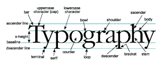
- and many more! Use the image below for a refresher for the parts of type.

The trick is to create ASYMMETRICAL BALANCE, using everything you've learned so far about visual hierarchy and the various principles of art to create a layout that is interesting to see, but also clear to read as well. Those of us who are truly great at art making need to also be great at laying out type on a page. They go hand in hand, especially in doing the most important thing we do in art -- showcasing our work to others.
STEP 3: Arranging type and manipulating leading, kerning, and tracking.
If you look at the character tools above, you also have options for kerning, tracking, and leading.
To review:
- Kerning: The amount of space between each individual character.
- Leading: The amount of space between a single line.... such as the space between the kerning definition here, and the leading definition.
- Tracking: The amount of spacing each letter has in the entire paragraph. Good for making large uniform adjustments.
A couple introductory rules of thumb:
Small text needs wider leading or tracking to be well read, and large text can sometimes benifit from less tracking.
With larger text, it is a good idea to manually modify the kerning between each letter by HOLDING OPTION + ARROW KEYS LEFT OR RIGHT
Here is a link that offers a more indepth example of the three, with images: http://www.designtheplanet.com/typography-101-kerning-and-leading/
STEP 4: Making multiple designs:
If you need to, you can use the ARTBOARD TOOL (SHIFT+O) below to create new artboards on the fly. This may help with making multiple layout designs for the same image.
- Click the artboard tool.
- Make sure all of your layers are unlocked.
- Locked layers will not duplicate the work in them to the new artboard.
- Hold option and shift. Click the artboard you're currently working on and hold.
- Drag out as many artboards as you need, and manipulate your type and images as needed.
You can also do all of these things in landscape!
Below you can see one image I made, as well as what my desktop looked like. There are a bazillion and one ways to lay out text and image. I was very impressed with what was created in class by everyone, and I'm excited to see how you use type in the future!

Subscribe to:
Posts (Atom)